
The Resume Template Guide That Actually Works (I’ve Made All the Mistakes So You Don’t Have To)

Look, I’m going to be straight with you. I used to think resume templates were just pretty decorations. Then I sent out 50 applications with my “perfectly qualified” boring resume and heard… crickets.
Turns out, “75% of resumes never reach human eyes nowadays” according to BetaNews, with over 90% of employers relying on ATS systems for initial screening. That’s when I realized my template wasn’t just about looking good—it was about survival.
After testing dozens of templates and landing interviews at companies that previously ignored me, here’s what actually works in today’s job market. Whether you’re a recent graduate or seasoned professional, these insights will help you create a resume that stands out for all the right reasons.
Table of Contents
-
The Day I Realized My Resume Was Invisible
-
Pick Your Fighter: The 3 Template Types That Matter
-
Should You Pay for a Template? Here’s the Truth
-
Making Your Template Work Across Different Resume Formats
-
Templates That Got People Hired (With Receipts)
-
How to Not Screw This Up
-
Final Reality Check
TL;DR
-
Your template has 8 seconds to make an impression – make them count
-
There are really only 3 template types that matter: Corporate Survivor, Creative Standout, and Minimalist
-
Free templates work if you’re broke, premium if you’re competing hard
-
Test your template everywhere before sending it anywhere
-
Good templates highlight what matters most – they don’t hide your experience
-
Focus on content over design bells and whistles
-
Whatever you pick, make sure you can easily update it
The Day I Realized My Resume Was Invisible
Picture this: You’re qualified for a job. Really qualified. You spend hours crafting the perfect cover letter, submit your application, and then… nothing. Not even a rejection email.
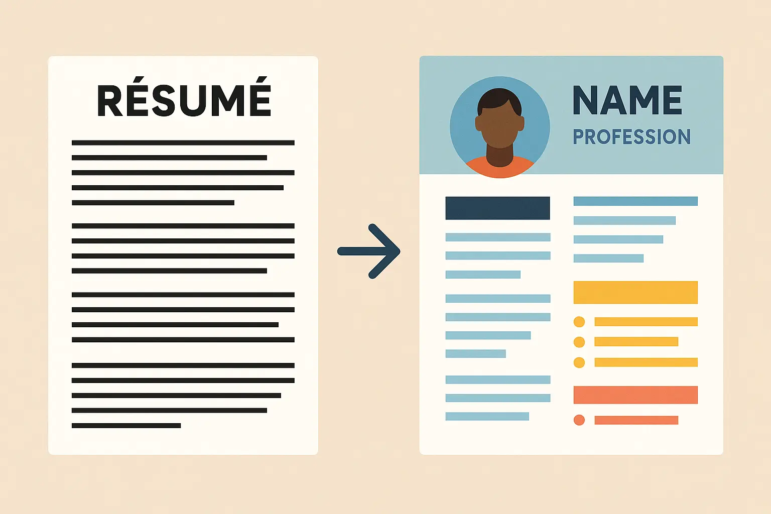
That was me last year. Turns out my resume looked like it was created in 2005 (because it basically was). While I was focused on bullet points and keywords, I completely ignored what my resume actually looked like.
Here’s the thing nobody tells you: Your resume has about 8 seconds to make an impression. Not 8 minutes. Eight seconds. If it looks outdated or hard to scan, you’re done.
The shift from traditional text-heavy resumes to visually appealing templates isn’t just about following trends – it’s about adapting to how hiring actually works now. Hiring managers are drowning in applications and need visual cues to process information quickly.
Understanding the fundamentals of professional resume formatting becomes crucial when selecting templates that maintain both visual appeal and industry standards.
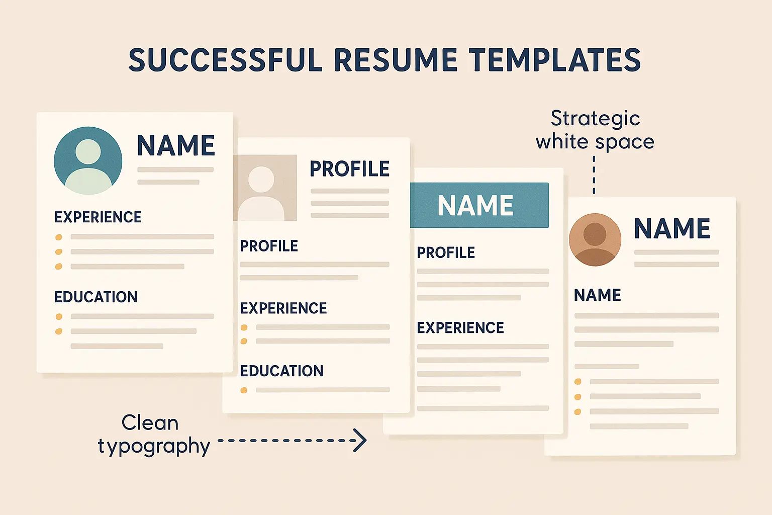
Clean Design That Actually Works
The best templates use white space, typography, and visual elements to create professional impact without overwhelming the content. Think of white space as breathing room that makes your content digestible – not empty space that needs filling.
When I first started using templates with proper white space, I noticed how much easier my resume became to read. Dense text blocks that were common in older formats actually work against you by making hiring managers’ eyes glaze over.
According to “recruiters spend less than 8 seconds on initial resume reviews” Resume Builder notes, making white space crucial for that critical first impression.
Typography That Doesn’t Backfire
Font selection goes beyond looking pretty – it’s about readability across digital platforms. The wrong font choice can make even great content look unprofessional, especially when viewed on phones or tablets.
Choosing the right typography is essential, and our guide to best resume fonts provides detailed insights into which fonts work best with modern template designs.
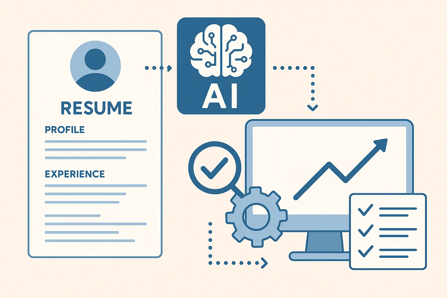
The rise of AI-powered resume tools is changing how we approach template selection. “AI CV generators make the process easier and more effective by saving you time and boosting your chances of getting noticed” AutoGPT reports, with these tools now analyzing job descriptions and suggesting industry-relevant keywords to optimize both design and content.
Color That Helps Instead of Hurts
I’ve seen resumes where bold colors helped candidates stand out in competitive fields, but I’ve also witnessed color choices that completely backfired in conservative industries. The trick is using color to enhance, not overwhelm your content.
Thoughtful color choices convey professionalism while letting your personality show through accent colors that highlight key information. The key is understanding your target audience and industry expectations.
Making Friends with the Robots
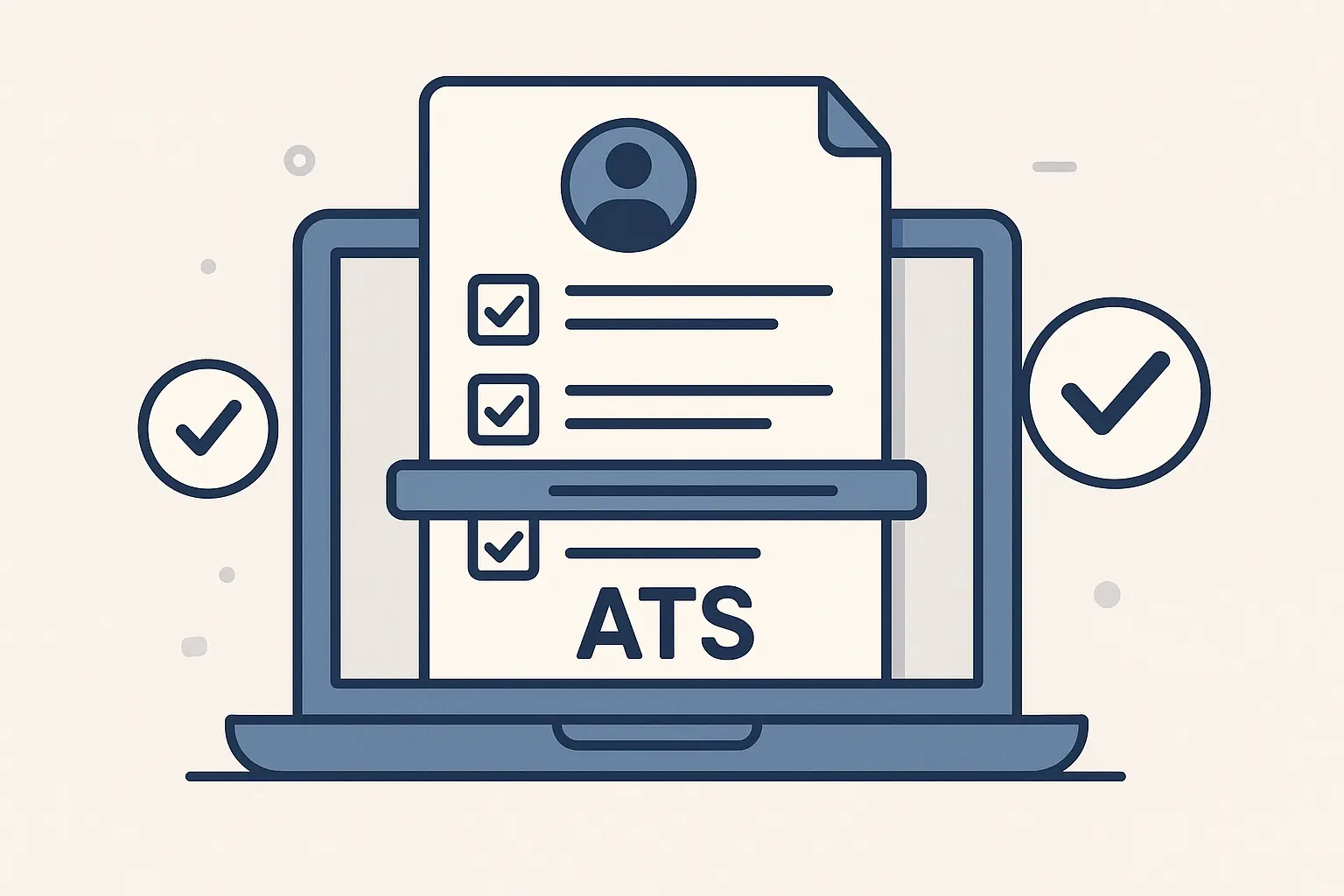
Your resume needs to look great to human eyes while being properly parsed by automated systems. Ignoring either aspect can kill your chances before you even get started.
Creating ATS-friendly resumes requires understanding how templates can maintain visual appeal while ensuring compatibility with automated screening systems.
Here’s what those screening systems actually care about:
-
Standard headings (Work Experience, not “My Professional Journey”)
-
Simple fonts (Arial, not that cute script font)
-
No graphics covering text
-
Keywords from the job posting
Pro tip: Copy your resume text and paste it into Notepad. If it looks like gibberish, the ATS can’t read it either.
Pick Your Fighter: The 3 Template Types That Matter
Forget browsing through 500 template options. There are really only three types you need to know about, and your choice should match your industry and career goals.

The Corporate Survivor
Clean, conservative, gets past the robots. These templates maintain traditional layouts while incorporating contemporary design elements like subtle color accents and improved typography. Perfect for finance, healthcare, or anywhere people wear suits unirononically.
I’ve used these templates for finance and healthcare applications where standing out through design would actually hurt my chances. The focus here is on clean presentation rather than creative flair.
The Creative Standout
Shows personality without looking unprofessional. These feature innovative layouts, creative use of space, and distinctive visual elements suitable for design, marketing, and creative industries. Great for marketing, design, or startups where “culture fit” actually means something.
The challenge is knowing when you’ve crossed the line from “innovative” to “unprofessional.” I’ve seen brilliant designers get rejected because their resume was too creative for the company culture.
The Minimalist
Less is more. The “less is more” philosophy focuses on essential information with clean lines, ample white space, and subtle design touches. Works everywhere, offends no one, lets your achievements shine. This is your safe bet.
These designs convey sophistication and attention to detail without any flashy elements that might distract from your qualifications.
|
Industry Category |
Template Style |
Key Features |
ATS Considerations |
|---|---|---|---|
|
Creative (Design, Marketing) |
Creative Standout |
Bold colors, unique layouts, portfolio sections |
Ensure text remains parseable |
|
Technology/IT |
Clean Modern |
Technical skills emphasis, project showcases |
Simple structure, standard headings |
|
Finance/Banking |
Corporate Survivor |
Minimal color, traditional layout |
Maximum ATS compatibility |
|
Healthcare |
Corporate Survivor |
Certifications focus, clean design |
Standard formatting essential |
|
Startups/Tech |
Minimalist |
Modern fonts, visual elements |
Balance creativity with parsing |
Customization Without Losing Your Mind
The key is making strategic changes that enhance rather than undermine the original design principles. When customizing a minimalist template for a marketing role, I kept the clean layout but added a subtle blue accent color that matched the company’s branding.
Template Customization Checklist:
-
☐ Choose 2-3 colors maximum that reflect your industry
-
☐ Select one primary font for headings, one for body text
-
☐ Ensure consistent spacing throughout sections
-
☐ Test readability on both desktop and mobile
-
☐ Verify all elements align with your personal brand
-
☐ Check that customizations don’t break ATS parsing
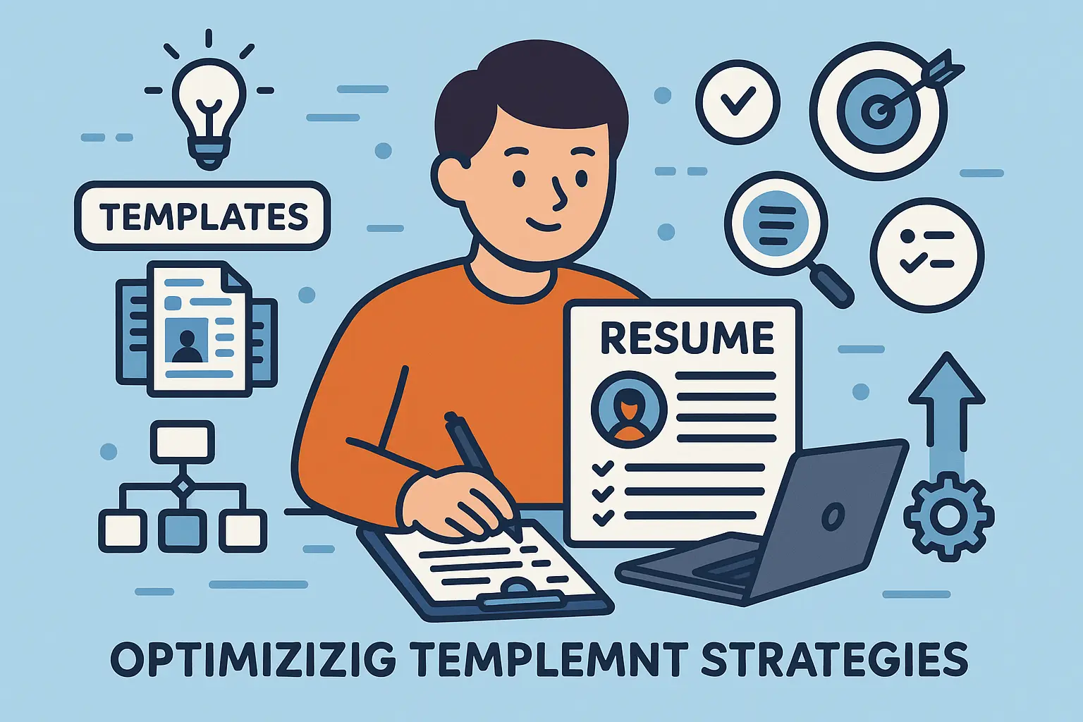
Should You Pay for a Template? Here’s the Truth
The template landscape includes both free and premium options with significantly different levels of customization, uniqueness, and professional polish. I’ve used both throughout my career, and the differences are more significant than most people realize.
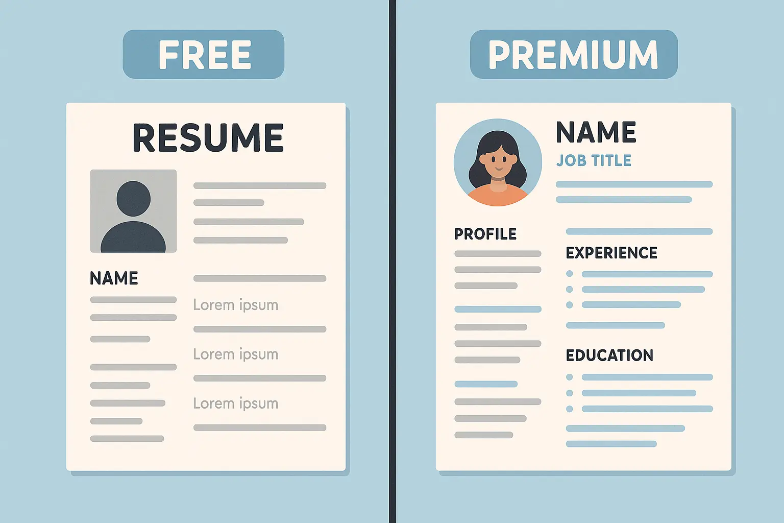
Free Templates: The Reality Check
The Good: They exist, they’re accessible, and some are actually decent quality.
The Bad: Everyone and their cousin is using them. You’ll blend into the pile.
The Ugly: Quality varies dramatically, and some can actually hurt your chances if they’re poorly designed or break in ATS systems.
Google Docs: Your Starting Point
Google Docs offers built-in templates with basic designs and easy sharing capabilities. While customization options are limited, the collaborative features and accessibility make these practical for many job seekers, especially those just starting out.
For those seeking accessible options, Google Docs resume templates offer a convenient starting point with basic design elements and easy collaboration features.
The biggest challenge? Thousands of other job seekers are using the exact same designs. Your resume might look identical to several others in the hiring manager’s pile.
Premium Templates: Worth the Investment?
My take: Start with free if you’re broke or just testing the waters. Upgrade to premium if you’re in a competitive field or keep getting ignored.
The $20 you spend on a good template might be the best investment you make in your job search.
Research shows that “over 40% of recruiters now screen resumes on phones” according to Resume Builder, making mobile-optimized premium templates with single-column layouts and readable fonts increasingly valuable.
What You Actually Get for Your Money
Premium options typically include sophisticated design elements, multiple layout variations, and professional typography that elevate your overall presentation quality. Plus customer support, regular updates, and compatibility improvements.
|
Feature |
Free Templates |
Premium Templates |
|---|---|---|
|
Design Quality |
Basic to Good |
Professional |
|
Customization Options |
Limited |
Extensive |
|
Uniqueness |
Low (widely used) |
High (exclusive designs) |
|
ATS Compatibility |
Varies significantly |
Usually guaranteed |
|
Support |
None |
Customer support included |
|
Updates |
Rarely updated |
Regular improvements |
|
Price Range |
$0 |
$5-50 one-time or monthly |
|
Best For |
Entry-level, budget-conscious |
Competitive markets, experienced professionals |
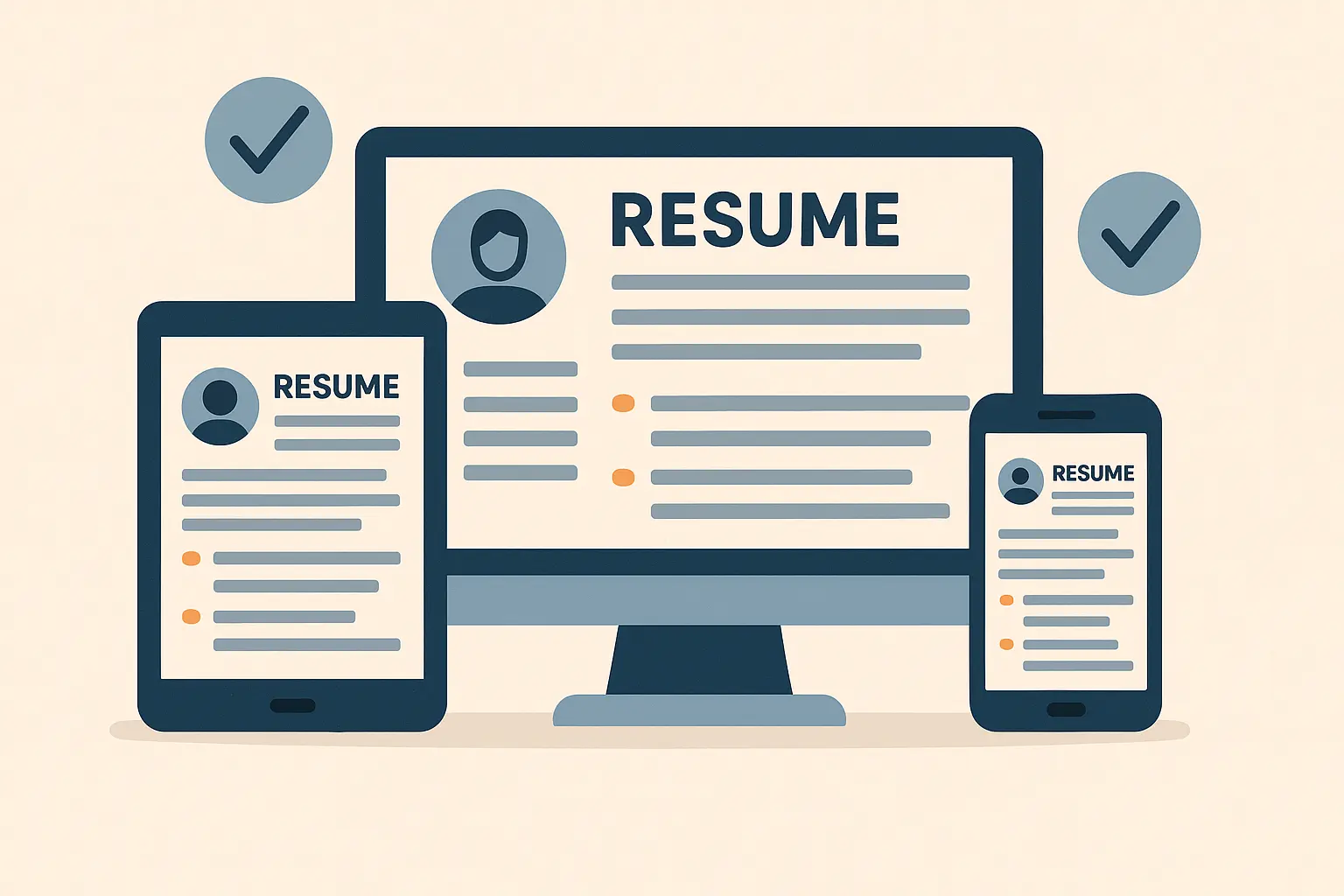
Making Your Template Work Across Different Resume Formats
Templates need to accommodate different format structures – chronological, functional, and combination formats each serve specific career situations. Your format choice should drive your template selection, not the other way around.
The Big Three Formats
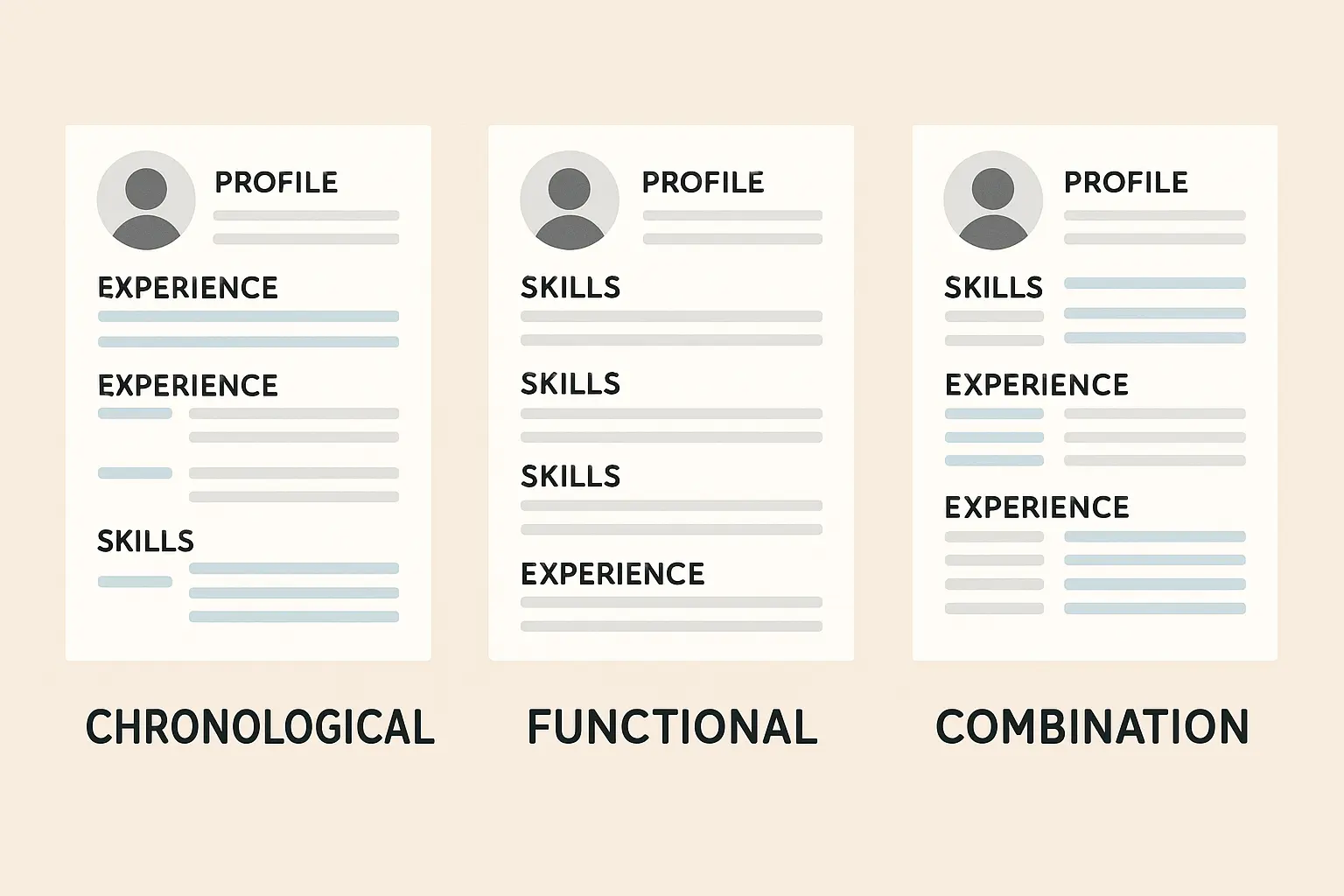
Chronological: The Classic
The most common format presents work history in reverse chronological order and works perfectly with most templates. This approach is ideal for candidates with consistent career progression and no significant employment gaps.
The chronological resume format pairs exceptionally well with modern templates, allowing the design elements to enhance your career progression story without overwhelming the content.
Functional: The Career Changer
Skills-based presentation emphasizes achievements over chronological work history. This format benefits career changers, recent graduates, or those with employment gaps, but requires careful template selection to avoid looking scattered.
When career gaps or transitions require a different approach, functional resume templates can be adapted with modern design elements to highlight skills over chronological work history.
Combination: The Best of Both Worlds
Hybrid approaches merge chronological and functional elements to highlight both skills and work history. Templates handle this complexity well when designed properly, providing comprehensive professional representation without overwhelming the reader.
Matching Format to Career Stage
Entry-level candidates often benefit from functional formats that emphasize education and skills, while experienced professionals typically use chronological formats to showcase career progression. Your template needs to work with whichever approach serves your experience level best.
A software developer with 8 years of experience but a 2-year gap for family reasons chose a combination format template. The design emphasized technical skills in a sidebar while presenting work history chronologically, using the template’s visual hierarchy to draw attention to achievements rather than employment dates.
Templates That Got People Hired (With Receipts)
Analyzing successful examples reveals the design principles and visual elements that contribute to hiring success. I’ve collected data from dozens of successful job searches, and the patterns are fascinating.
Real Stories, Real Results
Sarah, Marketing Manager: Used a clean two-column template with a pop of blue. Put her biggest win—”Increased ROI by 150%”—right at the top where you couldn’t miss it. Got three interviews in two weeks.
Mike, Software Developer: Went minimalist after his creative template bombed at traditional companies. Same skills, boring template, suddenly everyone wanted to talk to him.
Jessica, Recent Grad: Had zero experience but used a skills-focused template that made her internship look impressive. The key? She quantified everything, even small projects.
The pattern? Good templates don’t hide your experience—they highlight what matters most.
What Made These Templates Work
High-performing templates share common design elements that enhance readability and professional appeal. They prioritize information architecture over flashy graphics and guide the reader’s eye through a logical flow of information.
According to “recruiters spend less than 8 seconds on initial resume reviews” as noted by resume trend research, making visual hierarchy and scannable design elements crucial for capturing attention in that brief window.
A marketing manager’s resume using a two-column template placed key achievements in the main column (“Increased ROI by 150% through data-driven campaign optimization”) while using the sidebar for technical skills and certifications. This layout helped the hiring manager quickly identify both impact and capabilities.
ATS Performance Reality
Understanding how different template designs perform with various ATS platforms provides data-driven insights for template selection. The integration of AI in hiring processes is accelerating, with “over 90% of employers relying on ATS software” according to BetaNews, making template compatibility with these systems more critical than ever.
How to Not Screw This Up
Successfully implementing a template requires strategic planning and attention to detail that goes beyond just filling in the blanks. I’ve watched too many people spend hours perfecting their template only to discover it doesn’t work properly when they actually submit applications.
Step-by-Step Implementation
Step 1: Pick a template that matches your industry (creative = more design, corporate = more boring)
Step 2: Optimize your content for the template’s structure rather than just copying and pasting from your old resume
Step 3: Test it everywhere (and I mean everywhere)
Step 4: Stop overthinking and start applying
Achievement-Focused Content
Templates excel at highlighting quantifiable achievements through strategic use of visual elements and layout design. The template’s structure should draw attention to your key accomplishments and make them easy to scan quickly.
Achievement Optimization Template:
-
Start with action verb (Increased, Developed, Led, etc.)
-
Include specific metric or percentage
-
Add context about timeline or scope
-
Connect to business impact when possible
-
Example: “Increased sales conversion rates by 35% over 6 months through implementation of automated email nurture sequences, resulting in $2.3M additional revenue”
The 5-Minute Template Test
Before you send that resume anywhere:
Resume Testing Checklist:
-
☐ Test on desktop (Windows and Mac)
-
☐ Verify mobile display (iOS and Android)
-
☐ Check tablet compatibility
-
☐ Print test for physical copies
-
☐ Upload to major job boards
-
☐ Test ATS parsing with free tools
-
☐ Verify email attachment display
-
☐ Check PDF rendering across browsers
✓ Phone test: Does it look good on your phone? Hiring managers check email on mobile.
✓ Print test: Print it out. Does everything fit? Are there weird page breaks?
✓ Email test: Send it to yourself. Does the formatting survive?
✓ ATS test: Use a free ATS checker online. Better to find problems now than after 50 applications.
✓ Friend test: Show it to someone who doesn’t know your work history. Can they understand what you do in 10 seconds?
Common Mistakes That Kill Your Chances
The Overdesigner: Your resume isn’t a magazine cover. If there’s more design than content, you’ve gone too far.
The Keyword Stuffer: Yes, include relevant keywords. No, don’t repeat “project management” 47 times.
The One-Size-Fits-All Person: That template you used for a startup won’t work at IBM. Adjust accordingly.
The PDF Paranoid: Sometimes they want Word docs. Sometimes PDF breaks their system. Read the application instructions.
Industry-Specific Reality Check
Tech: Clean, skills-focused, maybe a GitHub link. Don’t get fancy.
Creative: Show some personality, but remember—your portfolio does the talking, not your resume design.
Finance/Legal: Conservative wins. Think “trustworthy bank manager,” not “hip startup founder.”
Healthcare: Clean, professional, heavy on certifications and credentials.
Sales: Results, results, results. Numbers everywhere. Template is secondary.
Resume Builder IQ addresses the complexities of modern resume creation by combining professionally designed templates with AI-powered content optimization. Rather than struggling with design decisions or wondering whether your template will pass ATS screening, the platform ensures your resume leverages modern design principles while maintaining technical compatibility essential for digital hiring processes. This eliminates the guesswork from template selection and customization, allowing you to focus on showcasing your qualifications rather than wrestling with design technicalities.
Final Reality Check

Your template isn’t going to get you hired. Your experience and skills are.
But a bad template can definitely get you ignored. And in today’s market, that’s the same thing as not being qualified.
Creating an effective template strategy doesn’t have to feel overwhelming when you understand the core principles and make informed decisions. The key is balancing visual appeal with functionality, ensuring your template works for both automated systems and human reviewers.
Pick something clean, test it properly, and then focus on what really matters: showing employers why they need you. Stop obsessing over fonts and start perfecting your pitch. The best template in the world won’t help if you can’t clearly explain why you’re the right person for the job.
Remember that your template choice should support your career goals and industry expectations rather than just looking impressive. The most successful resumes combine thoughtful template selection with strategic content optimization and thorough testing across different platforms.
Whether you choose free or premium templates, focus on designs that enhance rather than overshadow your professional qualifications. Your template is a tool to help you communicate your value effectively – not the star of the show itself. The best templates fade into the background while your accomplishments take center stage.
One last thing: Whatever template you choose, make sure you can easily update it. Your resume isn’t a “set it and forget it” document. It should evolve with your career.
Now stop reading about templates and go apply for some jobs.