
25 Best Resume Fonts That Actually Get You Hired (Complete Guide)
Look, I’ll be honest with you – I used to think font choice was just about making my resume look pretty. Boy, was I wrong. After sending out dozens of resumes with zero responses, I discovered my fancy font was literally invisible to the computer systems screening applications. Once I switched to boring old Arial? Suddenly my phone started ringing.
Your font selection goes way beyond just looking nice in today’s job market — in fact, picking the best font for resume submissions can be the difference between getting seen or getting ignored. Jobscan’s research shows that the wrong font can cause those computer systems to completely misread your resume, making it impossible for recruiters to find your qualifications when they search their databases. According to Jobscan’s recent testing of top applicant tracking systems, picking the right font can literally make or break whether your resume ever reaches human eyes.

Modern hiring is a two-step dance: first your resume needs to get past the robots, then it needs to impress the humans. The best fonts for resumes have to nail both requirements while sending the right professional signals for your specific industry and experience level.
Table of Contents
- Essential Criteria for Resume Font Selection
- Classic Professional Fonts (The Safe Choices)
- Modern Professional Fonts (Contemporary Choices)
- Elegant and Sophisticated Fonts
- Clean and Minimal Fonts
- Industry-Specific Fonts
- Emerging and Versatile Fonts
- Detailed Analysis of Top Resume Fonts
- Font Performance Analysis Against Key Criteria
- Advanced Font Optimization Techniques
- Font Selection Decision Tree
- How Resume Builder IQ Optimizes Your Font Choices
- Final Thoughts
TL;DR
- The computer systems come first – stick to fonts like Arial, Calibri, and Times New Roman if you want to guarantee they can actually read your resume
- Sans-serif fonts (Arial, Calibri, Helvetica) look better on screens, while serif fonts (Times New Roman, Georgia) work great for printing
- Conservative industries want traditional fonts, while creative fields let you get a bit more modern
- Size matters: 10-12pt for your main text, 14-16pt for section headers, 18-22pt for your name
- Test everything on different devices before you hit send
- Stay away from fancy, script, or custom fonts that confuse the computer systems
- Be consistent with your font usage – it shows you pay attention to details
The best resume fonts balance working with technology and looking professional to humans. Your font choice affects both computer parsing and human perception, making this decision way more important than most people realize.
Essential Criteria for Resume Font Selection
Understanding the importance of professional resume formatting goes hand-in-hand with picking fonts that actually work for your industry. Choosing resume fonts today means juggling demands that didn’t even exist ten years ago.
This is why choosing the best font for resume readability isn’t just design – it’s a technical decision that directly impacts whether your application survives. The best fonts have to satisfy both robot requirements and human preferences. This creates specific must-haves that separate fonts that work from ones that’ll sabotage your job search.
What looks professional varies big time across industries and generations. What a 25-year-old startup recruiter loves might seem totally unprofessional to a 55-year-old banking executive. Your font needs to work for everyone while staying universally acceptable.
What the Computer Systems Actually Need
Here’s the deal: those screening systems parse your resume to pull out key information for recruiter searches. Some fonts cause parsing errors that can eliminate you from consideration before any human even looks at your resume. System fonts like Arial, Calibri, and Times New Roman are often considered the best font for resume parsing, since they work almost perfectly every time.
The parsing process converts your visual resume into searchable text data. When fonts aren’t recognized, the system might skip entire sections or completely misinterpret what you wrote. This means your carefully crafted experience descriptions could become invisible to recruiters searching their databases.
My friend Jake’s wake-up call: Jake, a marketing guy, spent three weeks crafting the perfect resume but chose some artsy font he found online. Zero callbacks from 15 applications. When he discovered the computer systems couldn’t parse his decorative font choice and switched to Calibri? Three interviews in two weeks. Sometimes the simplest changes make the biggest difference.
The reality is harsh but simple: if the computer system can’t read your font, your qualifications never reach human eyes. This makes compatibility testing essential for any non-standard font choice.
Looking Professional to Actual Humans
Your font choice immediately tells hiring managers how professional you are. The best resume fonts balance looking current with being reliably conservative. They should seem up-to-date without appearing trendy or unprofessional.
Different generations of hiring managers have totally different font preferences. Younger recruiters often like clean, modern options without serifs, while experienced managers might prefer traditional fonts that feel stable and reliable. The smartest approach is choosing fonts that work across generational lines.
Industry culture makes a huge difference in how fonts are perceived. A font that seems innovative at a tech startup might look completely inappropriate at a law firm. Understanding these cultural differences helps you pick fonts that help rather than hurt your professional image.
Reading Clearly Everywhere
Recruiters spend only 6-7 seconds initially scanning resumes, making instant readability crucial. Your chosen font must stay clear whether someone’s viewing it on their phone, computer monitor, or printed pages. Things like character height, spacing, and line thickness all impact readability.
Screen-optimized fonts like Calibri and Verdana use specific design elements that make digital viewing better, while print-optimized fonts like Times New Roman stay clear when physically printed. Some fonts work great in both situations, making them particularly valuable for modern applications.
Mobile viewing creates unique challenges that tons of job seekers overlook. Small screens can make subtle font differences way more obvious, and poor mobile readability can immediately eliminate your resume from consideration.
Getting the Sizes Right
Your main text should be 10-12 points for maximum readability without looking cramped. Section headers work best at 14-16 points to create clear organization. Your name can go up to 18-22 points as the main focal point.
Don’t shrink font sizes to cram in more content – this usually backfires by making your resume hard to read. Instead, focus on writing concisely and choosing your content strategically.
| Font Size | What It’s For | Why This Size | Impact on Reading |
|---|---|---|---|
| 18-22pt | Your Name | Main focal point | Maximum visual impact |
| 14-16pt | Section Headers | Clear organization | Easy to scan |
| 10-12pt | Main Content | Primary text | Comfortable reading |
| 9pt minimum | Contact Info | Save space | Stay readable |
The relationship between font choice and sizing creates compound effects on readability. Some fonts stay clear at smaller sizes while others become impossible to read. Testing your specific font at various sizes ensures it looks good in all viewing situations.
Font size decisions should prioritize readability over cramming in content. A well-sized, easily readable resume with slightly less content beats a cramped, difficult-to-read document with more information every time.
Classic Professional Fonts (The Safe Choices)
These tried-and-true fonts offer maximum compatibility with computer systems and universal professional acceptance across all industries. Sure, they might not be exciting, but they guarantee your resume will be properly read and viewed favorably by conservative hiring managers. These fonts are the safest bets for job seekers who want function over flash.
Conservative hiring managers gravitate toward familiar fonts that signal reliability and attention to traditional professional standards. The best resume font choices in this category have decades of proven performance in business communications. You literally cannot go wrong with these fonts in terms of looking professional or causing technical issues.
1. Times New Roman – The Old Reliable
Times New Roman is probably the most globally recognized professional font and is frequently cited as the best font for resume use in conservative industries. Originally designed for The Times newspaper back in 1931, it’s incredibly readable in small sizes and maintains credibility across all industries.
Computer compatibility: Perfect – every system recognizes this font
Best for: Legal, academic, government, traditional corporate roles
Readability: Excellent for print, good for screen viewing
Professional vibe: Very traditional, might seem dated to younger recruiters
This font lets you fit a substantial amount of text on a page without making it hard to read. However, it was designed for print rather than digital viewing, which can be a drawback since most resumes are now viewed on screens. The serif design guides your eye across lines of text, reducing reading fatigue during long review sessions.
Legal professionals particularly love Times New Roman because it conveys authority and traditional competence. Academic institutions also prefer this font for its scholarly associations and proven readability in research documents.
2. Arial – The Universal Choice
Arial is probably the most widely used sans-serif font in professional documents. Its clean lines and excellent spacing make it readable across all mediums and devices, while being a system standard ensures it works everywhere.
Computer compatibility: Perfect – system standard font
Best for: Any industry, particularly great for international applications
Readability: Superior across all mediums and sizes
Professional vibe: Neutral and widely accepted
Microsoft created Arial as an alternative to Helvetica, and while some designers argue it lacks Helvetica’s subtle design details, its widespread availability and compatibility make it an excellent resume choice. You literally cannot find a more universally accepted font than Arial.
International job seekers benefit from Arial’s global recognition and cultural neutrality. The font looks professional across different business cultures without carrying specific regional associations that might seem inappropriate in certain contexts.
3. Calibri – The Modern Default
Microsoft’s default font since 2007, Calibri was specifically designed for reading on screens. Its subtle curves and excellent character spacing create high readability while maintaining a contemporary feel that appeals to modern hiring managers.
Computer compatibility: Excellent – widely supported across systems
Best for: Corporate, business, technology roles
Readability: Superior, especially on digital screens
Professional vibe: Modern yet conservative, widely accepted
The font’s clean design gives documents a contemporary and professional appearance. Being Microsoft’s default choice means most people find it familiar, though some might see it as generic. However, this familiarity actually works in your favor for resume applications where readability trumps uniqueness.
Corporate environments particularly appreciate Calibri’s modern professionalism. The font signals contemporary business competence without appearing trendy or inappropriate for traditional business contexts.
4. Cambria – The Screen-Smart Serif
Introduced with Microsoft Office in 2007, Cambria was specifically optimized for reading on screens while maintaining elegance when printed at small sizes. It strikes an ideal balance between contemporary and classic appeal.
Computer compatibility: Excellent across all major systems
Best for: Academic, publishing, professional services
Readability: Superior on both screen and print
Professional vibe: Sophisticated and highly readable
This font works exceptionally well for professional documents that need both digital and print compatibility. Its design ensures clarity even at smaller sizes, making it perfect for content-heavy resumes. The serif elements provide traditional credibility while the screen optimization ensures modern usability.
Publishing professionals and academic researchers find Cambria particularly appealing because it combines scholarly credibility with contemporary functionality. The font bridges traditional and modern professional expectations effectively.
Modern Professional Fonts (Contemporary Choices)
These fonts represent the evolution of professional typography, offering contemporary appeal while staying workplace-appropriate. They’re perfect for modern industries and companies that value innovation alongside professionalism. However, they need more careful consideration regarding computer system compatibility and industry acceptance.
Forward-thinking companies often appreciate candidates who show awareness of current design trends while maintaining professional standards. The best fonts in this category signal contemporary thinking without sacrificing business appropriateness. Modern industries can afford more visual personality than traditional choices.
5. Helvetica – The Design World Standard
Helvetica is so popular that someone made a documentary about it for its 50th anniversary. This Swiss sans-serif font has become synonymous with corporate branding and modern design, making it excellent for candidates in creative and business roles.
Computer compatibility: Very good across most systems
Best for: Creative industries, design, marketing, modern corporations
Readability: Excellent with clean, precise lines
Professional vibe: Modern, sophisticated, design-conscious
While Helvetica is standard on Mac systems, Windows users should know that Microsoft provides Arial instead. This can cause font substitution issues if not properly managed in your resume file. The font’s design heritage and corporate adoption by major brands gives it significant professional credibility.
Design professionals particularly value Helvetica for its clean geometry and visual sophistication. The font signals design awareness and attention to typographic detail, qualities that creative industries highly value in candidates.
6. Open Sans – The Friendly Professional
This humanist sans-serif font was designed specifically for web and print compatibility. Its friendly yet professional appearance makes it popular among tech companies and modern businesses that want to appear approachable.
Computer compatibility: Good (needs proper embedding for best results)
Best for: Tech, digital marketing, modern corporations, startups
Readability: Excellent, optimized for both web and print
Professional vibe: Friendly yet professional, contemporary
Open Sans works particularly well for companies emphasizing innovation and forward-thinking culture. However, make sure your PDF properly embeds the font to avoid computer system parsing issues. The humanist design elements create warmth while maintaining professional credibility.
Tech startups and digital agencies appreciate Open Sans for its modern appeal and web-native design philosophy. The font signals familiarity with contemporary digital design standards.
7. Lato – The Warm Professional
Lato combines professional appearance with warm, approachable characteristics. This humanist sans-serif font works well for companies that value both competence and human connection in their workplace culture.
Computer compatibility: Good (needs careful implementation)
Best for: Startups , creative agencies, modern businesses, consulting
Readability: Very high with warm, accessible character
Professional vibe: Contemporary, accessible, human-centered
The font’s design philosophy emphasizes clarity while maintaining personality. It’s particularly effective for roles requiring both technical competence and interpersonal skills. The warm character elements make it appealing for client-facing positions where approachability matters.
Consulting firms and service-oriented businesses often prefer fonts that balance professionalism with approachability. Lato achieves this balance effectively while maintaining contemporary appeal.
8. Source Sans Pro – The Adobe Standard
Created by Adobe specifically for user interfaces and professional documents, Source Sans Pro offers clean, modern aesthetics with excellent cross-platform compatibility. It represents the intersection of technical precision and visual appeal.
Computer compatibility: Good across modern systems
Best for: Tech, digital industries, modern corporations, design
Readability: Excellent across all platforms and sizes
Professional vibe: Clean, modern, tech-forward
This font signals familiarity with current design trends while maintaining professional credibility. It’s particularly effective for roles in technology and digital industries where contemporary design awareness is valued.
Software companies and digital agencies appreciate Source Sans Pro for its technical heritage and clean presentation. The font demonstrates understanding of modern design principles while maintaining business appropriateness.
Elegant and Sophisticated Fonts
These fonts convey refinement and intellectual sophistication, making them ideal for academic, publishing, and high-level professional roles. They demonstrate attention to detail and cultural awareness while maintaining excellent readability. These choices work best when you want to emphasize expertise and established credibility.
Senior-level positions often benefit from fonts that convey gravitas and intellectual depth. The best font for executive or academic contexts should signal sophistication without appearing pretentious. Fonts in this category appeal to hiring managers who value traditional excellence and attention to detail.
9. Georgia – The Screen-Smart Serif
Georgia was specifically designed for computer screen reading while maintaining the elegance of traditional serif fonts. Its clear character design ensures readability even at smaller sizes, both digitally and in print.
Computer compatibility: Excellent across all major systems
Best for: Publishing, education, professional services, consulting
Readability: Superior, especially at smaller sizes
Professional vibe: Elegant, readable, trustworthy
This font’s versatility makes it effective for both digital and print applications. Its widespread web use means most people find it familiar and professional. The serif elements provide traditional credibility while the screen optimization ensures modern functionality.
Real success story: David, a senior consultant applying for C-level positions, chose Georgia for his executive resume. The font’s sophisticated appearance complemented his 20+ years of experience, and hiring managers consistently commented on his resume’s polished, professional presentation. He received 3 executive interview opportunities within a month.
Publishing houses and educational institutions particularly appreciate Georgia’s scholarly associations and superior readability. The font bridges traditional academic credibility with contemporary digital functionality.
10. Garamond – The Classic Choice
This old-style serif font dates back to the 16th century but remains popular for its space efficiency and elegant appearance. Garamond uses less horizontal space compared to other fonts while maintaining excellent readability.
Computer compatibility: Very good across most systems
Best for: Publishing, academic, luxury brands, traditional professions
Readability: Good with classical appeal
Professional vibe: Sophisticated, traditional, refined
Garamond works particularly well for roles requiring attention to detail and appreciation for traditional excellence. However, it’s optimized for print rather than digital viewing. The historical pedigree of this font appeals to industries that value craftsmanship and established traditions.
Luxury brands and high-end consulting firms often favor Garamond for its refined appearance and space efficiency. The font signals appreciation for classical design principles and attention to typographic sophistication.
11. Minion Pro – The Adobe Text Font
Adobe designed Minion Pro specifically for professional text applications. This serif font excels in body text applications and conveys serious professional competence.
Computer compatibility: Good across modern systems
Best for: Publishing, academic, professional writing, consulting
Readability: Excellent for extended body text
Professional vibe: Highly professional, literary, sophisticated
This font choice signals familiarity with professional publishing standards and attention to typographic detail. It’s particularly effective for roles involving written communication. The design elements optimize readability for extended reading sessions.
Academic researchers and professional writers appreciate Minion Pro’s literary associations and superior text performance. The font demonstrates understanding of professional publishing standards.
12. Book Antiqua – The Palatino Alternative
Inspired by Palatino, Book Antiqua offers classical serif elegance with modern compatibility. It provides a sophisticated alternative to more common serif choices while maintaining excellent readability.
Computer compatibility: Very good across systems
Best for: Academic, publishing, traditional industries, consulting
Readability: Good with classical appearance
Professional vibe: Traditional, scholarly, established
This font works well for candidates wanting to convey both traditional values and contemporary competence. It’s particularly effective in industries that value historical perspective. The classical design elements appeal to hiring managers who appreciate established professional traditions.
Traditional consulting firms and established corporations often prefer fonts that signal respect for proven business practices. Book Antiqua achieves this while maintaining contemporary functionality.
Clean and Minimal Fonts
Look, sometimes less really is more. These fonts are like that friend who’s super reliable but doesn’t need to be the center of attention – they just get the job done without any drama.
If you’re in tech or engineering, you probably appreciate things that work well without unnecessary bells and whistles. These fonts are your people.
Technical professionals often prefer fonts that emphasize function over form. Fonts in engineering and technical fields should prioritize clarity and precision. The best font for technical contexts eliminates visual distractions while maintaining professional credibility.
13. Tahoma – The No-Nonsense Choice
Tahoma is like the Swiss Army knife of fonts. It was built for computer screens back when that actually mattered, and it’s got this slightly technical vibe that engineers love. Plus, it’s a bit more compact than Arial, so you can actually fit more stuff on your resume without making people squint.
Computer compatibility: Excellent across all systems
Best for: Corporate jobs, engineering, anything where you want to look competent without being flashy
Readability: Very high, condensed but clear
Professional vibe: Clean, efficient, modern
One hiring manager I know told me she can always spot the engineers’ resumes because they use Tahoma. Not because it’s bad – she just knows they picked the most efficient option and moved on with their lives.
Engineering firms and technical companies appreciate Tahoma’s functional approach to typography. The font signals efficiency and technical competence without unnecessary visual flourishes.
14. Verdana – The Screen Reader’s Best Friend
Microsoft literally designed Verdana to be super readable on screens. The downside? It’s kind of a space hog. You’ll fit less text per page, but what’s there will be crystal clear.
Computer compatibility: Excellent across all systems
Best for: Digital companies, online businesses, anywhere your resume will mostly be viewed on computers
Readability: Superior on screens, good in print
Professional vibe: Clear, modern, accessible
Verdana’s design versatility allows effectiveness in both digital and print contexts. However, its generous spacing means you’ll fit less content per page compared to more condensed fonts. The wide character spacing enhances readability but requires careful content management.
Digital marketing agencies and online businesses particularly value Verdana’s screen optimization. The font demonstrates understanding of digital-first design principles.
15. Trebuchet MS – The Approachable Professional
This one has a bit more personality than your typical corporate font, but it’s still totally professional. It’s like Arial’s friendlier cousin who’s still good at their job.
Computer compatibility: Very good across most systems
Best for: Jobs where you need to seem both competent and easy to work with
Readability: Good with distinctive character
Professional vibe: Friendly, approachable, modern
Trebuchet MS works well for roles requiring both technical competence and interpersonal skills. Its approachable character makes it effective for client-facing positions. The humanist design elements create warmth while maintaining business appropriateness.
Service industries and client-focused businesses often prefer fonts that balance professionalism with approachability. Trebuchet MS achieves this balance effectively.
16. Franklin Gothic – The Boss Font
Franklin Gothic means business. It’s got this authoritative thing going on that works great if you’re going for management roles or anywhere you need to project confidence.
Computer compatibility: Very good across systems
Best for: Leadership roles, management positions, anywhere you need to seem decisive
Readability: High with strong character presence
Professional vibe: Authoritative, professional, clear
Franklin Gothic’s strong character makes it excellent for senior-level positions where authority and competence are crucial. Its clear design ensures readability across all applications. The bold character presence commands attention without appearing aggressive.
Management consulting firms and corporate leadership positions often favor fonts that project authority and decisiveness. Franklin Gothic delivers these qualities while maintaining professional appropriateness.
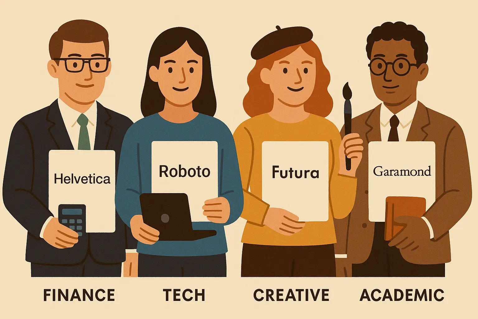
Industry-Specific Fonts
Here’s where things get interesting. Different industries have their own unwritten rules about what looks “right,” and ignoring them is like showing up to a black-tie event in flip-flops.
When preparing for specific industries, consider how banking interview preparation often requires conservative font choices that match the industry’s traditional values. What’s the best font for a resume varies significantly across different professional sectors. The best font choice depends heavily on industry culture and hiring manager expectations.
| Industry | Safe Bets | Why | Don’t Even Think About |
|---|---|---|---|
| Finance/Banking | Times New Roman, Arial | They want to see you respect tradition | Anything that looks “creative” |
| Creative/Design | Helvetica, Optima | Shows you know good design | Comic Sans (obviously) |
| Tech | Calibri, Open Sans | Modern but not trying too hard | Outdated fonts that scream “I don’t get technology” |
| Legal | Times New Roman, Georgia | Authority and credibility matter | Trendy fonts that might seem unprofessional |
| Healthcare | Arial, Calibri | Clean and trustworthy | Fancy fonts that might seem frivolous |
| Education | Georgia, Times New Roman | Academic credibility | Playful fonts that don’t match the seriousness |
17. Optima – The Creative Professional’s Choice
Optima is weird in the best way – it’s technically a sans-serif font, but it has these subtle curves that make it feel more sophisticated. Designers love it because it shows you actually think about typography.
Computer compatibility: Good across most systems
Best for: Design jobs, architecture, anywhere creativity matters
Readability: Excellent with unique character
Professional vibe: Distinctive, creative, sophisticated
This font choice signals design awareness and creative thinking while maintaining professional credibility. It’s particularly effective for roles requiring both creativity and business acumen. The unique character design sets it apart from standard business fonts without appearing unprofessional.
Architecture firms and design studios appreciate Optima’s distinctive character and sophisticated appearance. The font demonstrates aesthetic awareness while maintaining business credibility.
18. Palatino – The Academic All-Star
If you’ve ever read a textbook or academic paper, you’ve probably seen Palatino. It’s got this scholarly, “I’m smart and I know it” vibe that works great for education and research roles.
Computer compatibility: Very good across systems
Best for: Universities, research, publishing, anywhere brains matter more than flash
Readability: Excellent, designed for extended reading
Professional vibe: Scholarly, traditional, respected
Palatino’s book design heritage makes it particularly appropriate for roles involving extensive written communication or academic credentials. The font signals intellectual seriousness and scholarly competence.
Universities and research institutions consistently favor Palatino for its academic associations and superior readability in extended text applications. The font bridges classical scholarship with contemporary functionality.
19. Gill Sans – The Classy British Option
Gill Sans has this sophisticated, slightly British feel (because it literally is British). It’s like the font equivalent of a well-tailored suit – classic but not boring.
Computer compatibility: Good across most systems
Best for: Creative industries, international business, anywhere style matters
Readability: Very good with distinctive British character
Professional vibe: Sophisticated, design-conscious, international
Gill Sans works well for roles requiring cultural sophistication and design awareness. Its international recognition makes it effective for global business positions. The British design heritage appeals to companies valuing traditional craftsmanship with modern application.
International consulting firms and design agencies often prefer fonts that signal cultural sophistication and global awareness. Gill Sans delivers these qualities effectively.
20. Century Gothic – The Future-Forward Pick
This one’s got clean, geometric lines that say “I’m thinking about tomorrow, not yesterday.” Great for companies that pride themselves on being innovative.
Computer compatibility: Good across systems
Best for: Startups, tech companies, anywhere innovation is valued
Readability: Good with distinctive geometric style
Professional vibe: Modern, clean, forward-thinking
Century Gothic signals innovation and contemporary thinking while maintaining professional appearance. It’s particularly effective for roles in emerging industries. The geometric design elements appeal to companies emphasizing precision and modern methodology.
Tech startups and innovative agencies appreciate Century Gothic’s forward-thinking aesthetic and clean geometric design. The font signals alignment with contemporary business thinking.
Emerging and Versatile Fonts
These are the new kids on the block. They’re modern and stylish, but you need to be a bit more careful with them because not every system plays nice with newer fonts.
Progressive companies often seek candidates who demonstrate awareness of current trends while maintaining professional standards. The best fonts in innovative industries can afford more contemporary styling than traditional choices. Fonts in this category appeal to hiring managers who value both innovation and competence.
21. Roboto – The Google Standard
Google uses this everywhere, so if you’re applying to tech companies, it shows you’re plugged into the current design world. Just make sure your PDF actually includes the font properly.
Computer compatibility: Good (needs proper web font implementation)
Best for: Tech jobs, digital companies, startups
Readability: Excellent, optimized for digital viewing
Professional vibe: Modern, tech-forward, clean
Roboto’s association with Google’s design philosophy makes it particularly effective for roles in technology and digital innovation. However, ensure proper font embedding to avoid computer system issues. The mechanical precision appeals to companies emphasizing systematic approaches and technical excellence.
Software development firms and digital agencies appreciate Roboto’s technical heritage and contemporary design philosophy. The font signals familiarity with current digital design standards.
22. Montserrat – The Trendy Risk
This font is having a moment right now. It looks great and modern, but it’s also kind of trendy, which means it might not age well or work perfectly everywhere.
Computer compatibility: Fair (needs very careful implementation)
Best for: Creative agencies, modern marketing roles
Readability: Very good with urban-inspired design
Professional vibe: Contemporary, stylish, confident
Montserrat works best for roles emphasizing creativity and modern thinking. However, its trendy nature may not suit conservative industries or traditional hiring managers. The urban design inspiration appeals to companies valuing contemporary culture and innovative thinking.
I know someone who used Montserrat for startup applications and got great responses, but when she tried it for a corporate job, the hiring manager couldn’t even open her resume properly. Know your audience.
Creative agencies and modern marketing firms often prefer fonts that demonstrate contemporary design awareness. Montserrat signals alignment with current aesthetic trends while maintaining professional credibility.
23. Proxima Nova – The Balanced Modern Choice
This one strikes a nice balance between looking current and being reliable. It’s modern without being too trendy.
Computer compatibility: Good across modern systems
Best for: Modern businesses, consulting, general professional roles
Readability: Excellent, well-balanced proportions
Professional vibe: Sophisticated, modern, versatile
Proxima Nova’s versatility makes it suitable for diverse roles while maintaining contemporary appeal. It signals design awareness without appearing overly trendy. The balanced proportions ensure readability across different viewing contexts.
Business consulting firms and modern corporations appreciate Proxima Nova’s sophisticated balance of contemporary styling with professional reliability. The font demonstrates design awareness without sacrificing business appropriateness.
24. Myriad Pro – The Adobe Professional
Adobe uses this in a lot of their stuff, so it has this professional, corporate feel while still looking current.
Computer compatibility: Good across systems
Best for: Business roles, creative industries, general applications
Readability: Excellent across all mediums
Professional vibe: Professional, versatile, clean
Myriad Pro’s corporate adoption by major companies gives it professional credibility while maintaining modern appeal. It’s particularly effective for business development and client-facing roles. The humanist design elements create approachability while maintaining business credibility.
Corporate communications departments and business development teams often prefer fonts that balance professionalism with contemporary appeal. Myriad Pro achieves this balance effectively.
25. Avenir – The Sophisticated Future
“Avenir” literally means “future” in French, and this font lives up to it. It’s got this elegant, forward-thinking vibe that works great for high-level positions.
Computer compatibility: Good across most systems
Best for: Senior roles, consulting, design-conscious businesses
Readability: Very good, inspired by classic geometric principles
Professional vibe: Elegant, sophisticated, future-focused
Avenir’s design philosophy emphasizes timeless appeal with contemporary execution, making it ideal for roles requiring both creative thinking and business acumen. The geometric foundation provides structure while the refined execution adds sophistication.
Strategic consulting firms and design-conscious businesses appreciate Avenir’s sophisticated balance of classical geometric principles with contemporary refinement. The font signals appreciation for both traditional design excellence and modern innovation.
Detailed Analysis of Top Resume Fonts
This comprehensive analysis examines the most critical font choices across multiple performance criteria including computer system compatibility, readability, and professional impact. Understanding these detailed characteristics helps you make informed decisions based on your specific industry and career goals.
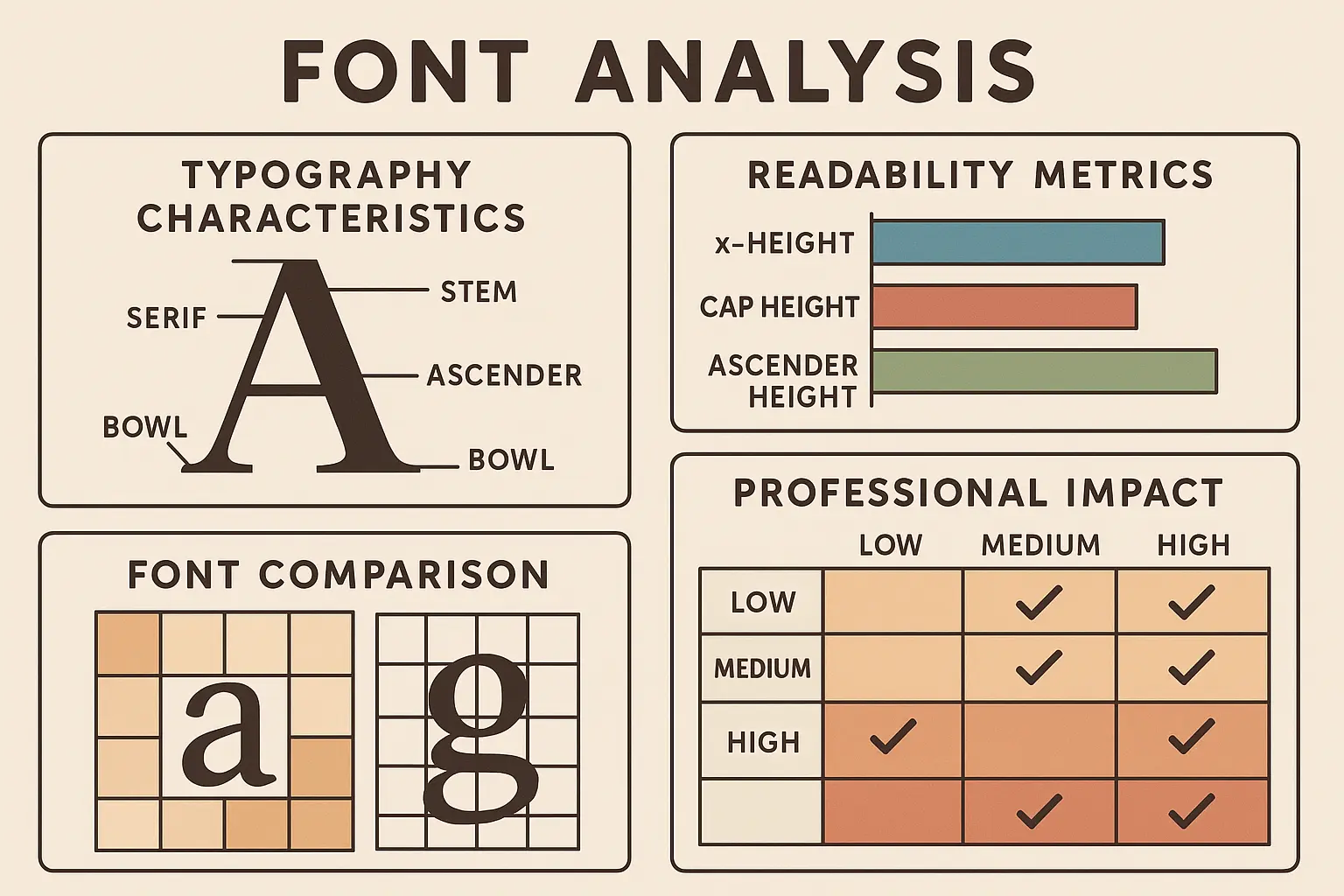
The best resume font choices require deep analysis beyond surface-level aesthetics. Resume fonts perform differently across various technical and cultural contexts, making detailed evaluation essential for optimal selection.
Times New Roman Deep Dive
Times New Roman’s newspaper origins give it unmatched credibility in traditional industries. Its high character density allows substantial content without sacrificing readability, making it ideal for comprehensive resumes in academic or legal fields.
The font’s serif design guides eye movement across lines of text, reducing reading fatigue during extended review sessions. However, its print optimization means it may appear less sharp on high-resolution screens compared to fonts designed for digital viewing.
Legal professionals consistently choose Times New Roman for its authoritative appearance and proven readability in formal documents. The font’s historical usage in official communications reinforces its credibility in traditional professional contexts.
Arial Comprehensive Analysis
Arial’s universal availability across all operating systems eliminates font substitution concerns. Its neutral character makes it appropriate for international applications where cultural font preferences might vary.
The font’s clean geometry ensures consistent rendering across different devices and printing systems. Its widespread corporate adoption means hiring managers view it as professionally appropriate without being memorable or distinctive.
International business applications particularly benefit from Arial’s cultural neutrality and universal recognition. The font avoids regional associations that might seem inappropriate in certain cultural contexts.
Calibri Professional Assessment
Calibri’s screen optimization includes subtle design elements that enhance digital readability while maintaining print compatibility. Its slightly rounded characters create a warmer appearance than purely geometric fonts.
The font’s status as Microsoft’s default choice since 2007 means most business professionals find it familiar and appropriate. However, this ubiquity can make it appear generic in competitive application pools.
Modern corporate environments consistently appreciate Calibri’s contemporary professionalism and superior screen readability. The font rarely receives negative feedback from hiring managers in business contexts.
Font Performance Analysis Against Key Criteria
This analysis ranks fonts across critical performance metrics, helping you understand which choices excel in specific areas. The rankings consider computer system compatibility, readability across different mediums, professional impact, and industry suitability to guide your selection process.
Understanding font performance requires systematic evaluation across multiple criteria. The best font for your resume depends on how well it performs in your specific application context.
Computer System Compatibility Rankings
Tier 1 (Perfect Compatibility): Times New Roman, Arial, Calibri, Cambria, Georgia, Tahoma, Verdana achieve near-perfect parsing rates across all major computer screening platforms. These fonts guarantee your resume content will be properly extracted and searchable.
Tier 2 (Excellent Performance): Helvetica, Garamond, Book Antiqua, Trebuchet MS, Franklin Gothic, Palatino perform well across most systems with occasional minor parsing variations.
Tier 3 (Good with Precautions): Open Sans, Lato, Source Sans Pro, Optima, Gill Sans, Century Gothic, Roboto, Proxima Nova, Myriad Pro, Avenir require proper embedding and testing but generally perform well.
Tier 4 (Requires Careful Implementation): Montserrat, Minion Pro need extensive testing and may require fallback fonts for optimal computer system performance.
| Font Category | System Score | Readability Score | Professional Impact | Best Use Case |
|---|---|---|---|---|
| Times New Roman | 10/10 | 9/10 | Traditional (9/10) | Conservative industries |
| Arial | 10/10 | 9/10 | Universal (8/10) | All industries |
| Calibri | 10/10 | 10/10 | Modern (9/10) | Corporate/business |
| Helvetica | 9/10 | 10/10 | Design-forward (9/10) | Creative industries |
| Georgia | 10/10 | 9/10 | Sophisticated (9/10) | Academic/publishing |
| Open Sans | 7/10 | 9/10 | Contemporary (8/10) | Tech/startups |
| Montserrat | 6/10 | 8/10 | Trendy (7/10) | Creative agencies |
Cross-Platform Readability Assessment
Screen-Optimized Champions: Calibri, Verdana, Georgia, Open Sans, Lato, Roboto excel in digital viewing with design elements specifically created for screen clarity.
Print Excellence Leaders: Times New Roman, Garamond, Minion Pro, Palatino maintain superior clarity and character definition when physically printed.
Universal Performers: Arial, Cambria, Tahoma, Helvetica, Source Sans Pro deliver consistent quality across both digital and print mediums.
Mobile viewing creates additional challenges that desktop-optimized fonts may not handle effectively. Screen-optimized fonts maintain clarity even when viewed on smaller displays, while print-optimized options may lose definition on mobile devices.
Professional Impact Categories
Traditional Authority: Times New Roman, Garamond, Palatino, Book Antiqua convey established credibility and conservative professionalism.
Modern Professional: Calibri, Helvetica, Open Sans, Lato, Proxima Nova balance contemporary appeal with workplace appropriateness.
Creative Professional: Optima, Gill Sans, Montserrat, Avenir demonstrate design awareness while maintaining professional standards.
Universal Acceptance: Arial, Georgia, Tahoma, Verdana work effectively across all industries and professional contexts.
The psychological impact of font choice extends beyond conscious recognition. Hiring managers form immediate impressions based on typographic choices, making professional impact assessment crucial for strategic font selection.
Advanced Font Optimization Techniques
These technical considerations ensure your font choices perform optimally across all viewing platforms and submission methods. Proper implementation prevents common issues that can undermine even excellent font selections, while advanced techniques maximize your resume’s visual impact and technical compatibility.
Technical implementation often determines whether excellent font choices succeed or fail in real-world applications. Resume font optimization requires understanding both typography principles and technical constraints that affect document delivery and viewing.
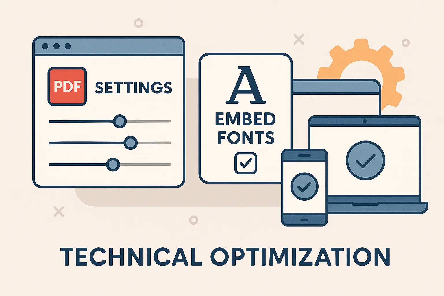
PDF Export Best Practices
Always embed fonts when creating PDF versions to prevent substitution issues. Use RGB color mode for digital viewing while testing CMYK compatibility for print applications. Verify font rendering across different PDF viewers and mobile devices.
Check file size impact, as embedded fonts can significantly increase document size. Test print preview functionality to ensure consistent appearance across different printer types and paper qualities.
Font embedding prevents the dreaded font substitution that can completely alter your resume’s appearance. When fonts aren’t embedded, viewing systems substitute available alternatives, potentially destroying your carefully planned typography.
Cross-Platform Compatibility Strategies
Windows systems render fonts differently than Mac computers, particularly for fonts like Helvetica versus Arial. Test your resume on both platforms when possible, or choose universally available system fonts.
Mobile viewing requires special consideration, as smaller screens can make subtle font differences more pronounced. Sans-serif fonts generally perform better on mobile devices due to their cleaner character shapes.
Cloud-based document sharing introduces additional variables that can affect font rendering. Google Drive, Dropbox, and similar platforms may alter font appearance depending on viewing applications and device capabilities.
Font Licensing Considerations
System fonts (Arial, Times New Roman, Calibri) are free for all uses and universally available. Adobe fonts require active subscriptions for commercial use, which could create access issues for recipients.
Google Fonts are free but may need proper embedding for offline viewing. Premium fonts often aren’t worth the computer system compatibility risks they introduce. The legal implications of font usage rarely affect resume applications, but understanding licensing prevents potential issues.
Commercial font licenses typically allow resume usage, but sharing documents with embedded commercial fonts may violate licensing terms. System fonts eliminate these concerns entirely while providing excellent performance.
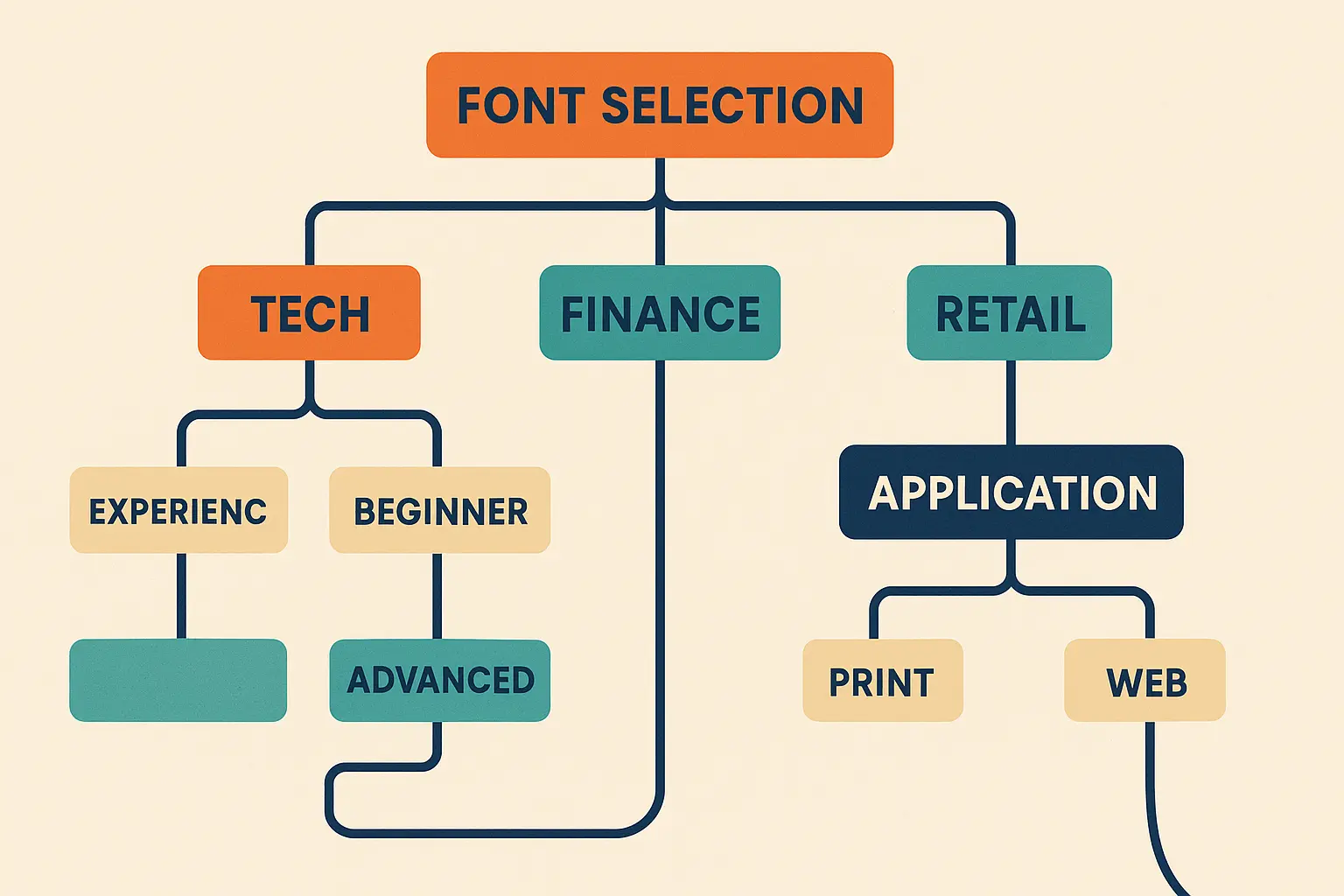
Font Selection Decision Tree
This systematic approach guides you through the font selection process based on your specific circumstances, industry requirements, and career goals. Following this decision tree ensures you consider all relevant factors while avoiding common selection mistakes that could harm your application success.
Career professionals in specialized fields like certified pharmacy technicians should consider industry-standard fonts that convey medical professionalism and attention to detail. Strategic font selection requires systematic evaluation rather than intuitive choices that may not align with professional expectations.
Industry-First Analysis
Conservative Industries (Finance, Law, Government): Start with Times New Roman, Arial, or Calibri. These fonts convey reliability and traditional professionalism that conservative hiring managers expect.
Creative Industries (Design, Marketing, Media): Consider Helvetica, Open Sans, Optima, or Gill Sans. These fonts demonstrate design awareness while maintaining professional credibility.
Technology Sector: Calibri, Arial, Open Sans, Lato, or Source Sans Pro work well. These fonts signal contemporary thinking and technical competence.
Academic/Research: Times New Roman, Georgia, Cambria, Palatino, or Garamond convey scholarly credibility and intellectual seriousness.
Industry culture significantly influences font perception beyond functional considerations. What appears innovative in one sector may seem inappropriate in another, making industry-specific analysis essential for optimal selection.
Experience Level Considerations
Entry-Level Candidates: Choose clean, simple fonts like Arial or Calibri that won’t distract from your developing qual ifications. Avoid fonts that might appear presumptuous or overly stylized.
Mid-Career Professionals: Professional standards like Times New Roman, Helvetica, or Georgia demonstrate established competence while remaining appropriately conservative.
Executive-Level Candidates: Sophisticated options like Georgia, Garamond, or Proxima Nova can convey the gravitas and attention to detail expected at senior levels.
Experience level affects how hiring managers interpret font choices. Senior candidates can afford more sophisticated typography, while entry-level applicants should prioritize clarity and conservative appeal.
Application Method Optimization
Online Applications: Prioritize computer system-optimized fonts from Tier 1 and Tier 2 compatibility rankings. Your resume must survive automated parsing before human review.
Direct Submissions: Allow more flexibility with modern options, but maintain professional appropriateness for your target industry.
Print Networking: Choose high-readability options like Georgia or Times New Roman that maintain clarity when physically printed and reviewed.
Application method determines which technical constraints matter most for your font selection. Online submissions require different optimization than direct networking or print applications.
The Reality Check: What Actually Matters
Here’s the thing nobody wants to tell you: most hiring managers aren’t sitting there analyzing your font choice like typography nerds. They’re scanning your resume for about 6 seconds, looking for relevant experience and skills.
But – and this is important – if your font is hard to read, looks unprofessional, or (worst case scenario) breaks their computer system, you’re out before they even see your qualifications.
So here’s my honest advice: unless you’re applying for design roles where your aesthetic choices actually matter, just pick something clean, readable, and boring. Arial, Calibri, Times New Roman – they’re popular for a reason. They work.
Quick Decision Guide
If you want to play it completely safe and guarantee you’re using the best font for resume scanning: Arial or Calibri.
If you’re in a traditional industry: Times New Roman
If you’re in tech or startups: Calibri or Open Sans
If you’re in creative fields: Helvetica or Optima
If you’re applying for senior roles: Georgia or Garamond
Red flags to avoid:
- Anything that looks like handwriting
- Fonts that are hard to read at normal size
- Super trendy fonts that might not work on all computers
- Comic Sans (I mean, come on)
How Resume Builder IQ Optimizes Your Font Choices
Resume Builder IQ eliminates font selection guesswork by automatically choosing optimal fonts based on your industry, experience level, and target roles. The platform’s AI-driven approach ensures perfect computer system compatibility while maintaining professional appeal, allowing you to focus on content rather than technical formatting concerns.
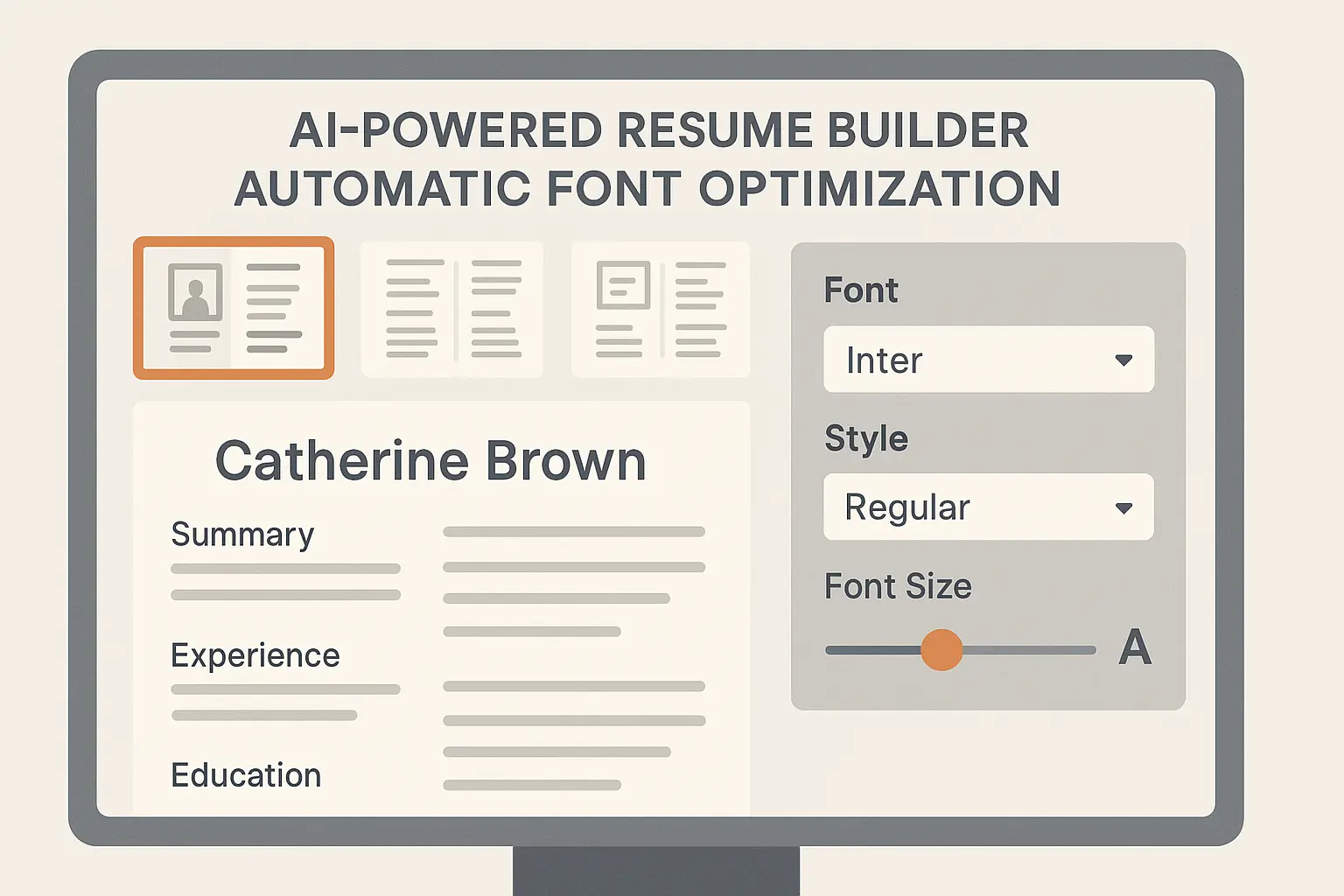
Healthcare professionals seeking positions like physician assistants benefit from Resume Builder IQ’s industry-specific font recommendations that match medical field expectations. The platform’s intelligent font selection system analyzes your target industry and automatically applies the most effective font choices for your specific situation.
The AI system considers multiple factors simultaneously: computer system compatibility requirements, industry expectations, experience level appropriateness, and modern design trends. This comprehensive analysis eliminates the risk of choosing fonts that might harm your application’s success. Resume font optimization becomes automatic rather than guesswork.
Beyond font selection, Resume Builder IQ optimizes sizing, spacing, and hierarchy to create visually appealing documents that perform excellently in both computer systems and human review. The platform’s templates incorporate the best practices from our font analysis while ensuring consistent, professional presentation.
Ready to create a resume with perfectly optimized font choices? Try Resume Builder IQ’s free resume builder and let our AI select the ideal font for your industry and career goals.
The Bottom Line
Your font choice won’t get you the job, but the wrong choice might keep you from getting the interview. Pick something professional, make sure it’s readable, test it on different devices, and then focus on the stuff that actually matters – like whether you can do the job.
The best font for resume use is one that doesn’t distract from your qualifications while staying readable across all devices. If someone remembers your font choice more than your experience, you probably picked wrong.
Choosing the right resume font represents a critical intersection of technology and psychology in modern job searching. Your font selection must satisfy both computer parsing requirements and human aesthetic preferences while conveying appropriate professional signals for your industry and experience level.
The fonts we’ve analyzed represent proven choices that balance these competing demands effectively. Whether you choose the universal reliability of Arial, the modern professionalism of Calibri, or the sophisticated appeal of Georgia, success depends on matching your choice to your specific circumstances and target audience.
Font selection is just one element of resume optimization. The most beautiful typography cannot compensate for weak content, poor formatting, or inadequate keyword optimization. However, the wrong font choice can undermine even exceptional qualifications by preventing your resume from reaching human reviewers or creating negative first impressions.
As computer screening technology continues evolving and design trends shift, staying informed about font performance and professional expectations remains crucial for job search success. The investment in proper font selection pays dividends through improved parsing rates, enhanced readability, and stronger professional presentation across all application channels. Resume font decisions deserve the same strategic attention as content development and keyword optimization.