
Resume Format Secrets That Actually Get You Hired (No More Rejection Emails)

Here’s the thing nobody tells you: your resume format and overall appearance matter way more than what you actually write. I spent weeks perfecting my job descriptions, only to find out later that robots were tossing my resume in the digital trash before any human even glanced at it.
The best resume format often depends on your field, so aligning your design with industry standards is just as important as your content. Those “digital gatekeepers” (ATS systems) are pickier than a toddler at dinnertime. Get the formatting wrong, and your resume disappears into the void – regardless of how qualified you are.
According to recent statistics, “a job opening receives an average of 250 resumes, but only 2% of applicants are invited for an interview” (Glassdoor). This competitive landscape makes understanding proper resume format more critical than ever before — the wrong structure alone can eliminate you before content is even read.

TL;DR
- Your resume format can kill your chances before anyone reads your qualifications
- 75% of resumes get rejected by ATS systems due to poor formatting, not lack of skills
- Single-column layouts work better on mobile devices where most recruiters view resumes
- Free templates can be just as effective as paid ones if you know what to look for
- Strategic white space and visual hierarchy guide recruiters to your best achievements
- Following a simple formatting process eliminates guesswork and ensures consistency
Why Your Resume Format Is Sabotaging Your Job Search
The wrong resume format can block you from opportunities even if your qualifications are perfect. Reality check: most people obsess over what to write while completely ignoring how it looks. My perfectly crafted content was getting filtered out by automated systems before any human saw it.
Research shows that “only 25% of resumes make it past the ATS and in front of a human recruiter! This means that 75% of resumes don’t qualify because of formatting, content, or lack of keywords” (Gitnux). That’s three out of four qualified candidates getting tossed in the digital trash.
Your resume format can make or break your entire job search before anyone considers your qualifications. Understanding the fundamentals of professional resume format is essential for creating documents that pass both ATS screening and human review.
The Hidden Rules of Modern Resume Standards
Every industry has unspoken formatting rules that can torpedo your first impression. Hiring managers spend an average of six seconds scanning resumes. During those crucial moments, they’re not reading your bullet points – they’re deciding if your document looks professional enough to deserve their attention.
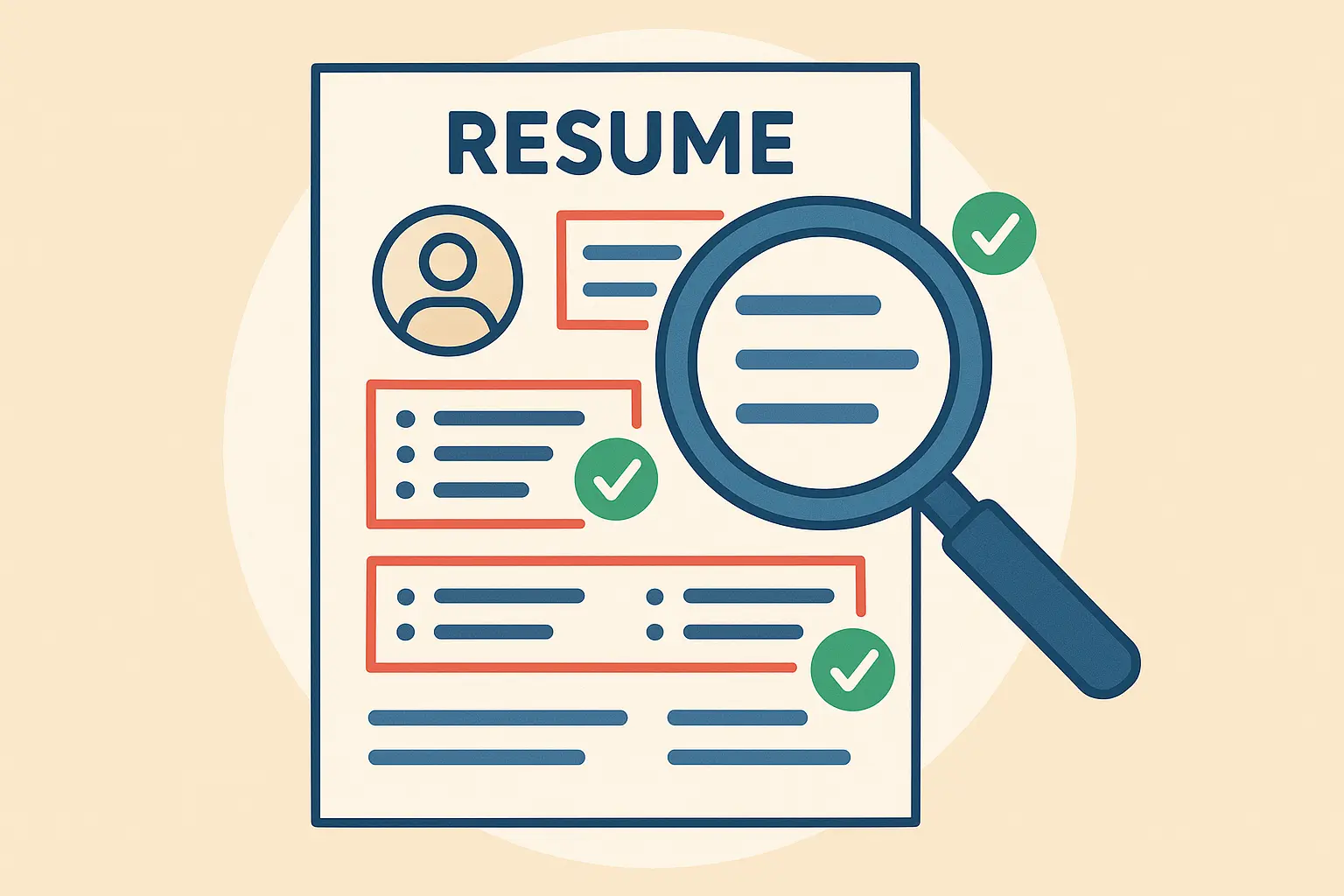
What Every Resume Must Include (No Exceptions)
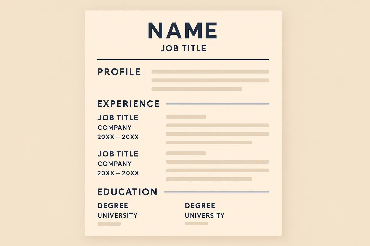
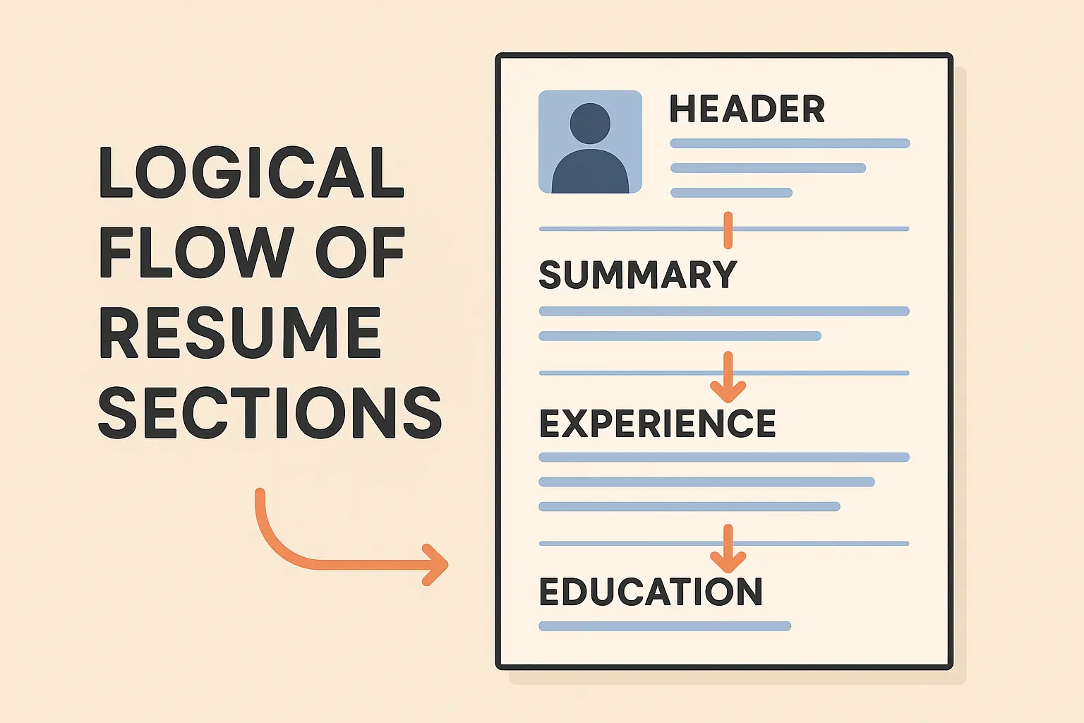
Your resume needs five core components: a clear header with contact info, a compelling professional summary, work experience in reverse chronological order, education positioned based on your career stage, and skills that match the job requirements. Miss any of these, and you signal that you don’t understand professional standards.
When I review resumes for friends, I’m amazed by how many skip these basics. They’ll spend hours on job descriptions but use an unprofessional email address or forget their LinkedIn URL. These oversights immediately disqualify otherwise strong candidates.
Here’s the structure recruiters expect to see:
| Essential Resume Section | Purpose | Placement |
|---|---|---|
| Header with Contact Info | Immediate access to your details | Top of page |
| Professional Summary | Hooks reader and summarizes value | Below header |
| Work Experience | Demonstrates relevant background | Main body |
| Education | Shows qualifications and credentials | After experience (or before if recent grad) |
| Skills | Matches job requirements | Bottom or sidebar |
A properly structured header looks like this:
John Smith
john.smith@email.com | (555) 123-4567 | LinkedIn.com/in/johnsmith | City, State
Typography That Makes or Breaks First Impressions
Font selection might seem trivial, but I’ve watched hiring managers dismiss resumes simply because the typography looked unprofessional. Stick with Arial, Calibri, or Times New Roman in 10-12 point size for body text. Use bold headers strategically to guide the reader’s eye to your most impressive accomplishments.
Consistent spacing and bullet points aren’t just aesthetic choices – they determine whether someone actually reads your content. A recruiter once told me she almost passed on my application because inconsistent formatting made it difficult to scan quickly.
Recent federal hiring reforms emphasize standardized formatting. “The transition period ends September 27, 2025. Applicants will need a 2-page resume to apply via USAJOBS” (OPM), signaling a broader shift toward consistent formatting standards across all sectors.
Beating the Robots: ATS-Friendly Formatting
Applicant Tracking Systems are the invisible barrier between you and your dream job, and choosing the right resume format determines whether you pass or fail. These programs scan your resume before any human sees it, and they’re incredibly picky about formatting. I used to think ATS optimization was buzzword nonsense until I reformatted my resume and suddenly started getting callbacks from companies that had previously ignored me.
The wake-up call came when my beautifully designed resume was being rejected by automated systems. All those hours perfecting my content were wasted because I didn’t understand how these systems work.

Design Elements That Don’t Confuse the Machines
ATS software reads resumes using basic text scanning technology, which means your creative formatting choices might work against you. Use standard section headings like “Work Experience” and “Education” instead of clever alternatives. Avoid complex tables or graphics that confuse the parsing software. Always save your resume in both PDF and Word formats.
Clean, simple layouts aren’t boring – they’re strategic tools for getting past automated screening. I tested this by submitting the same content in different formats to various companies. The ATS-friendly version generated three times more interview requests than my “creative” design.
Smart Keyword Integration Without Sounding Robotic
Keyword stuffing makes your resume sound robotic, but strategic placement can dramatically improve your ATS scores. I mirror language directly from job descriptions, weave industry-specific terms naturally throughout my experience bullets, and front-load my skills section with relevant technical competencies.
Data reveals that “candidates only included 51% of relevant keywords in their resume (with a 60% match rate for hard skills and only a 28% match rate for soft skills)” (ResyMatch). This gap represents a massive opportunity for job seekers who properly optimize their keyword usage.
File Format Strategy That Covers All Bases
PDF preserves your formatting across different systems and devices, but some ATS platforms prefer Word documents for easier text extraction. I always prepare both versions and follow application instructions religiously.
When in doubt, PDF is usually safer for maintaining visual design, but having a Word backup ensures you’re covered regardless of the company’s technical preferences. This dual-format approach has saved me from technical compatibility issues that could have derailed promising applications.
Mobile-First Resume Design
Hiring managers increasingly review resumes on their phones during commutes or between meetings. If your resume looks terrible on a mobile screen, you’re automatically at a disadvantage. A recruiter told me she almost passed on my application because my multi-column layout was unreadable on her iPhone.
The mobile revolution has fundamentally changed how resumes are consumed. Recruiters no longer sit at desks with large monitors – they’re scrolling through candidates while waiting for coffee or during brief breaks between meetings.

Single-Column Layouts That Work Everywhere
Complex multi-column designs might look sophisticated on desktop, but they become jumbled messes on smaller screens. Single-column layouts ensure your content flows logically regardless of screen size, making it easy for recruiters to scan your qualifications on any device.
I made this mistake early in my career by using a two-column template that looked great on my computer but was completely unreadable on mobile devices. The formatting disaster cost me several opportunities before I realized what was happening.
Professional Resume Templates That Don’t Suck (And How to Pick One)
Let’s be real – scrolling through resume templates online feels like shopping for a used car. Everything looks shiny until you actually try to use it, then you realize half of them are junk that’ll make you look unprofessional.
I’ve road-tested dozens of templates, and here’s what I’ve learned: most are either boring as watching paint dry or so flashy they’d make a Vegas billboard jealous. Neither works.
The template marketplace is flooded with options that look impressive in screenshots but fail miserably in real-world applications. The secret is understanding how your industry, experience level, and career goals should influence your design choices.
Pick Templates That Match Your Actual Job
Your template needs to fit your industry like a good suit. I’ve watched people torpedo their chances by using artsy templates for accounting jobs, or bland corporate layouts for creative roles.
Think of it this way: would you wear flip-flops to a law firm interview? Same logic applies to your resume design.
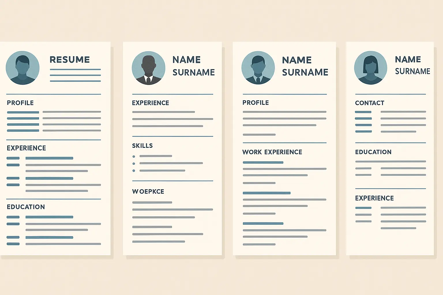
Industry-Specific Design Considerations
Creative fields like graphic design or marketing can handle more visual flair and strategic color usage, while traditional corporate environments expect conservative, text-focused layouts. Healthcare, finance, and legal professions typically favor straightforward designs that emphasize credentials and experience over visual creativity.
I always research company websites and LinkedIn profiles of employees in similar roles to gauge the appropriate level of design sophistication. This reconnaissance work has prevented me from making costly template mistakes.
| Industry Type | Design Approach | Key Elements |
|---|---|---|
| Creative (Design, Marketing) | Modern, visual flair | Strategic color, creative headers |
| Corporate (Finance, Consulting) | Conservative, clean | Black text, minimal graphics |
| Healthcare/Legal | Traditional, credential-focused | Emphasis on certifications, education |
| Tech | Clean, modern | Skills-focused, technical competencies |
| Academia | Detailed, comprehensive | Publications, research emphasis |
Career Stage Matters Too
Entry-level candidates benefit from templates that highlight education, internships, and transferable skills prominently, while mid-career professionals need layouts that showcase progressive responsibility and quantifiable achievements. Executive-level resumes require sophisticated designs that convey leadership presence and strategic thinking.
Your template should tell the story of where you are in your career journey. I’ve seen recent graduates use executive-style templates that made them look presumptuous, and senior professionals use entry-level formats that undersold their experience.
Recent guidance from career experts emphasizes adapting resumes to career stages. “On the entry-level side of things, I would say just own where you are in life. Just because your resume isn’t packed with work experience doesn’t mean that you don’t have relevant experience to showcase” (Deloitte Services LP), highlighting the importance of stage-appropriate formatting.
Customization Without Losing Professionalism
Templates are starting points, not final destinations. The best resumes take a solid foundation and personalize it strategically to reflect individual strengths and job requirements. Subtle customization often makes a bigger impact than dramatic design overhauls.
The temptation to completely overhaul a template is strong, but restraint usually produces better results. Small, strategic modifications can personalize your template without compromising its professional integrity or ATS compatibility.
Color and Font Personalization Done Right
One or two accent colors maximum keeps your template professional while adding visual interest. I ensure high contrast between text and background for easy reading, and select fonts that reflect my industry culture while maintaining universal readability.
Decorative fonts might look appealing, but they often don’t display correctly across different systems and can confuse ATS software. I learned this when my carefully chosen font rendered as gibberish on the hiring manager’s computer.
Here’s an effective color scheme approach:
- Primary text: Black (#000000)
- Headers: Dark blue (#2C3E50)
- Accent elements: Light blue (#3498DB)
- Background: White (#FFFFFF)
This combination maintains professionalism while adding subtle visual interest.
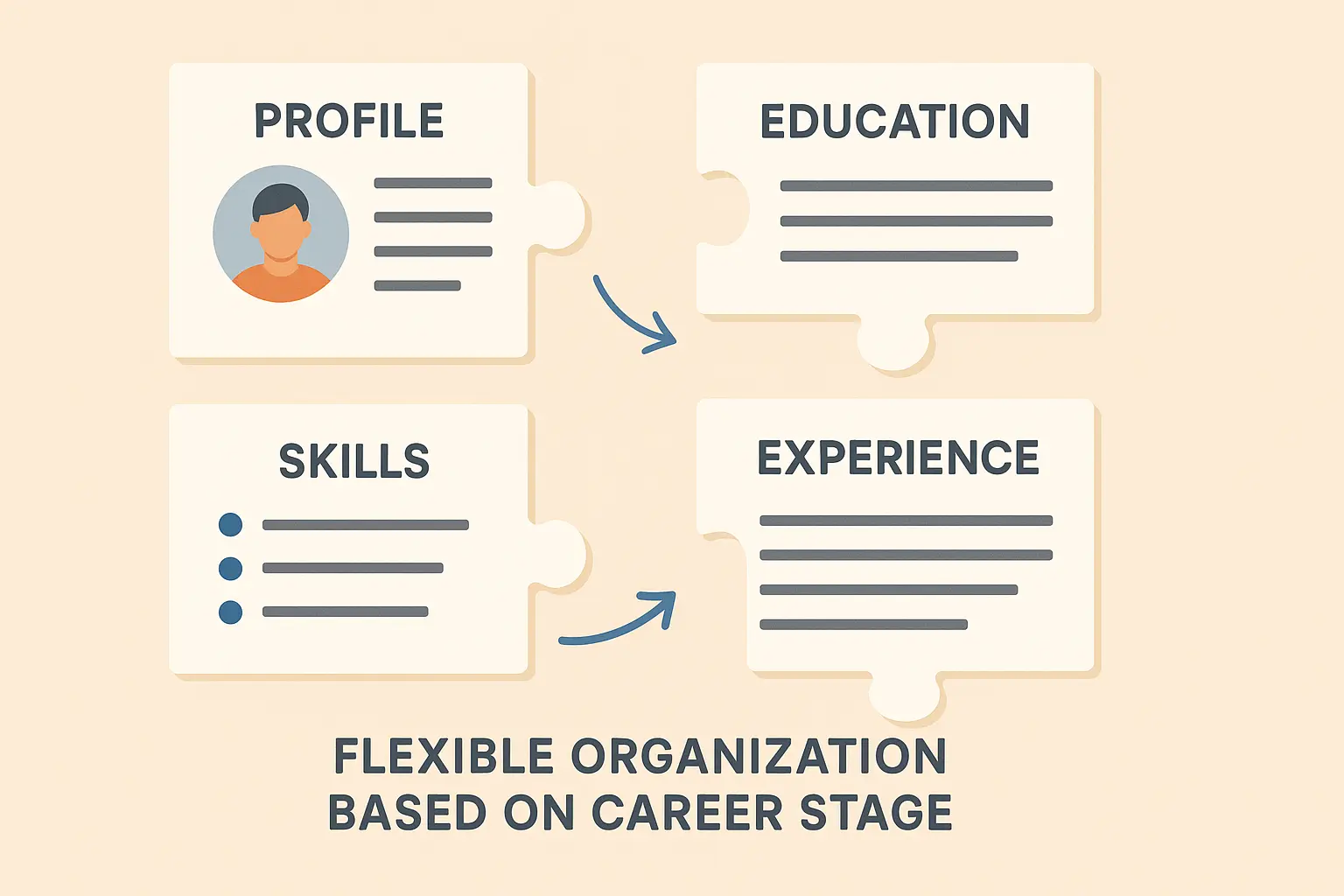
Strategic Section Reorganization
Your strongest qualifications should appear first, which means section order should vary based on your background and specific job requirements. Recent graduates might lead with education and relevant coursework, while experienced professionals should prioritize work history and achievements.
For technical roles, I often move the skills section higher to immediately showcase relevant competencies that match job requirements. This strategic reorganization can dramatically improve your chances of capturing the recruiter’s attention within those crucial first few seconds.
Free Resume Resources That Actually Work
You don’t need to drop $50 on a template. Some of the best ones I’ve used were completely free – you just need to know how to spot quality.
The assumption that free equals inferior quality doesn’t hold true in the resume template world. Some of the best free templates I’ve used outperform expensive alternatives in both design quality and ATS compatibility.
Finding Quality Free Templates
The
The challenge with free templates is separating the wheat from the chaff. Search results are cluttered with poorly designed options that could actually damage your professional image, but hidden among them are gems that rival premium alternatives.
When searching for quality templates, it’s helpful to review various sample resumes to understand what professional formatting looks like across different industries.
Red Flags to Avoid vs. Green Flags to Look For
Red flags to avoid:
- Weird fonts that look like ransom notes
- So many colors it looks like a unicorn exploded
- Layouts that only work on desktop (mobile matters!)
- Templates that haven’t been updated since 2015
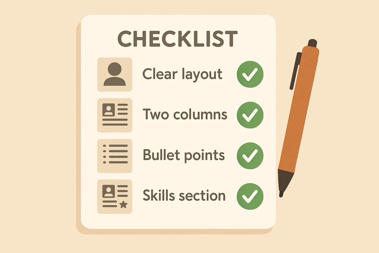
Green flags to look for:
- Clean, readable fonts
- Works on phones and computers
- Available in both PDF and Word
- Actual human reviews, not just star ratings
High-quality free templates feature clean, consistent layouts with proper spacing and professional typography. They include multiple format options, provide clear customization instructions, and are regularly updated to reflect current design trends.
Building Your Own When Templates Fail
Sometimes you need to ditch the templates and go DIY. It’s not as scary as it sounds, and you’ll have complete control over how everything looks.
Building from scratch intimidates many job seekers, but the control it provides can be worth the extra effort. I’ve created some of my most successful resumes by starting with a blank document and applying formatting principles systematically.
Word Processing Basics That Matter
Keep margins between 0.5-1 inch (any smaller looks cramped). Stick to fonts everyone has: Arial, Calibri, Times New Roman. Use tables for alignment – they’re invisible but keep everything neat. Save multiple versions (trust me on this one).
These technical skills might seem basic, but they’re the foundation of professional document creation. Mastering these fundamentals gives you the flexibility to create exactly what you need without being constrained by template limitations.
According to research, “77% of resumes were outside of that range” of the ideal 475-600 word count (TalentWorks), suggesting most people struggle with proper content organization and formatting fundamentals.
Stay Consistent or Look Amateur
Set your rules upfront and stick to them religiously. This includes font sizes for different heading levels, spacing between sections, bullet point styles, and date formats. Creating a personal style guide prevents inconsistencies that make your resume look amateurish.
Personal Resume Style Guide:
- Name: 18pt, Bold, Calibri
- Section Headers: 14pt, Bold, Calibri
- Body Text: 11pt, Regular, Calibri
- Bullet Points: • (solid circle)
- Date Format: MM/YYYY – MM/YYYY
- Margins: 0.75″ all sides
- Line Spacing: 1.15
- Section Spacing: 12pt after
Advanced Formatting Tricks That Make Recruiters Stop Scrolling
Ready to level up? These subtle tweaks can make your resume stand out without looking like you’re trying too hard.
Basic formatting gets you in the game, but strategic visual enhancements can make your resume memorable in a sea of similar applications. These advanced techniques require careful execution to maintain professionalism while creating visual interest.
White Space Is Your Friend
Cramming everything onto one page usually backfires. White space makes your resume easier to read and less overwhelming. Think of it as the pause between sentences – it gives people time to process what they just read.
White space isn’t empty space – it’s a powerful design element that improves readability and creates visual breathing room between sections. Adequate margins frame your content professionally, while consistent spacing between sections helps organize information logically.
I use white space to prevent my resume from looking cluttered or overwhelming, especially when I have extensive experience to showcase. The temptation to cram everything onto one page often backfires by making the document unreadable.
Professional Graphics That Enhance Rather Than Distract
Subtle design elements such as section dividers, professional icons, or progress bars for technical skills can add visual interest without compromising ATS compatibility. The key is ensuring all graphics are simple, professional, and won’t interfere with automated scanning systems.
I test every visual element to make sure it serves a functional purpose rather than just decoration. Graphics that don’t add meaningful value to your resume format should be eliminated to maintain focus on your qualifications.
Make Your Wins Impossible to Miss
Formatting isn’t just about appearance – it’s a strategic tool for highlighting your most impressive achievements and ensuring key information catches the recruiter’s attention. I use formatting techniques to guide readers to the accomplishments that best match job requirements.
Before diving into advanced formatting, it’s worth reviewing common banking interview questions to understand what recruiters prioritize when reviewing financial sector resumes.
Smart Bullet Point Strategy
Bullet points break up dense text and make your accomplishments scannable, while bold formatting draws attention to key metrics and results. I start each bullet point with strong action verbs and quantify achievements with specific numbers, percentages, or dollar amounts whenever possible.
Smart bullet point strategy:
- Start with action words (managed, increased, created)
- Include actual numbers (boosted sales 23%, managed team of 8)
- Put your biggest wins first in each job section
This formatting approach transforms boring job descriptions into compelling achievement statements. The visual hierarchy created by consistent bullet formatting helps recruiters quickly identify your most relevant qualifications.
Skills Section That Works
Organizing skills into logical categories (Technical, Soft Skills, Languages) makes it easy for recruiters to find relevant qualifications quickly. I use consistent formatting for skill levels and consider visual elements such as progress bars for technical competencies, but I always ensure ATS compatibility by including text-based skill lists alongside any visual representations.
Group related skills together instead of random lists. “Programming Languages,” “Project Management Tools,” “Certifications” – make it easy for recruiters to find what they need.
Your Step-by-Step Formatting Game Plan
Having a systematic approach eliminates guesswork and ensures consistent results every time you create or update your resume. This process has saved me countless hours and prevented formatting mistakes that could derail my job applications.
Understanding salary expectations, such as PA salary secrets, can help you format your compensation history section appropriately for healthcare roles.
Here’s the exact process I use every time:
Setup (5 minutes)
I start every resume with proper document setup: 1-inch margins on all sides, professional font selection (Arial, Calibri, or Times New Roman) in 11-12 point size for body text and 14-16 point for my name, and 1.15 line spacing for optimal readability. The header contains all essential contact information formatted cleanly and prominently.
- Set margins to 0.75 inches
- Pick your font and sizes
- Create your header with contact info
Structure (15 minutes)
Reverse chronological order for work experience ensures recruiters see your most recent and relevant positions first, while consistent bullet point formatting creates visual unity throughout the document. I align dates to the right margin for clean appearance and use clear, bold section headings with adequate white space separation.
- Plan your section order based on your strengths
- Write section headers that are bold and clear
- Set up consistent spacing
Content (the hard part)
For specialized roles, consider reviewing certified pharmacy tech salary information to understand how compensation formatting varies across healthcare positions.
- Work experience in reverse order (newest first)
- Bullet points that start strong and include numbers
- Skills that match the job posting
Final Check
My final formatting review checks for consistency across all sections, proper alignment and spacing, uniform fonts and sizes, and overall professional appearance. I test how the resume displays across different devices and software programs to ensure it maintains its formatting integrity regardless of how it’s viewed.
Final check:
- Does it look good on your phone?
- Can you save it as both PDF and Word?
- Did you proofread everything twice?
This quality check prevents embarrassing formatting errors that could undermine an otherwise strong application. Taking the time for thorough review has saved me from submitting documents with glaring inconsistencies that would have immediately disqualified me from consideration.
Resume Builder IQ takes all this formatting headache off your plate. Our AI handles the technical stuff while you focus on telling your story. With 25+ templates that actually work and built-in ATS optimization, you can skip the trial-and-error phase and jump straight to landing interviews. Our platform offers 25+ professionally designed templates that are mobile-responsive and ATS-friendly, plus intelligent suggestions for keyword integration and content optimization.
Ready to stop wrestling with formatting and start getting interviews? Try Resume Builder IQ’s free resume builder today.
The Bottom Line
Your resume format isn’t just about looking pretty – it’s the strategy that gets past ATS robots and impresses recruiters. Get it right, and you’ll finally start getting those interview calls you deserve.
The best part? Once you nail your formatting system, you can use it for every application. No more starting from scratch each time.
Resume formatting might seem minor, but it’s often the deciding factor between getting an interview and getting ignored. I’ve seen too many qualified candidates miss opportunities simply because their resume formatting didn’t meet professional standards or failed to pass ATS screening.
The strategies in this guide aren’t just theoretical advice – they’re battle-tested techniques that have helped me and countless others break through the initial screening barriers and land interviews at competitive companies. Your qualifications matter, but proper resume format ensures they actually get seen by the people who can hire you.
As you implement these formatting strategies, remember that different industries have unique expectations, so exploring various interview questions can help you tailor your resume format to specific employer needs.